4.2 Creating an Object
The class of the desired object is either set by selecting the corresponding Object Icons or by selecting a model from the list on the right. For the creation of menuitems in menus that are used to set options, analogously to objects of the type checkbox and radiobutton, these objects can also be selected directly. The type of the menuitem is then set automatically.
Independent objects (window, messagebox) are created directly. For objects that can only be children of another object, their parent object has to be clicked once before the child object can be placed. To define windows as children of another window, enable the option Child Window in the popup menu, which is opened with the right mouse button by clicking in the window icon.
The object position is set at the same time the object is selected.
The label/text window appears before the actual object is created. The internal label of the object and the value of the text, title, or content attribute (whichever applicable) is input here. If the window is closed with Cancel, the specified values will not be set.
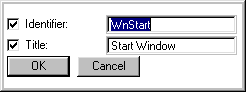
Opening of the label/text window can be switched off by selecting the item from the menu. This is especially useful for Rapid Prototyping.
4.2.1 Object Icons
This section lists all objects, describes their basic function, and displays the corresponding icon from the main window.
All interactive objects of a dialog are created within a window. An individual window contains a logical hierarchy of objects, which in turn may be divided into subhierarchies.
This object is a message window that can be used to display questions about the status of the dialog (e.g. Cancel action/Don't cancel action
). It utilizes the functionality of message windows as provided by OSF/Motif and Microsoft Windows.
A groupbox creates a logical subgroup of objects within a window. A groupbox needs no visible features in order to have an object group; it can just be used to create program-internal groups.
A rectangle mainly serves for the graphic layout of the dialog. Specific areas in a window can be visually separated with a rectangle; in addition, a rectangle can be used to create horizontal or vertical lines.
A statictext contains text that cannot be edited at runtime; it is used as labelling information.
By means of an edittext new textual information can be input at runtime.
A two-valued setting can be achieved with checkboxes. As opposed to radiobuttons, it is always possible to select one or more alternatives from a given number of checkboxes.
Radiobuttons are used to make an either/or decision, i.e. only one may be selected from a number of alternatives. A group of radiobuttons should usually be provided in a separate groupbox.
A pushbutton is used to confirm or trigger a given action in the dialog.
A poptext is a listed cluster of statictexts. While only one line is visible in the unselected state, all texts become visible when the poptext is selected. A poptext is marked with a small arrow.
A listbox can be used to string together textual information and make the texts available for selection.
The tablefield can be used to output or manipulate arbitrarily formatted lists, comparable to a spreadsheet.
An image serves to load an internal or external graphic (also called tile in the tutorial). The Dialog Manager uses a simple internal raster format for tiles; in addition, the following external formats can be imported:
This object offers an area (canvas) that can be filled by means of system commands of the graphics system used. Modules that directly use the libraries of the window system can thus be integrated into Dialog Manager applications.
A scrollbar is generally used for objects whose internal display area is larger than the area actually displayed on the screen (e.g. in windows, tablefields, or listboxes). In addition, a scrollbar can be used for numerical settings if it is not directly hooked to an object.
The notebook is used to collect a number of notepages.
Note
Available only on certain platforms.
A notepage is one page of a Notebook. It may be used to hold other dialog objects similar to a groupbox.
Note
Available only on certain platforms.
Menu: menubox, menuitem, menuseparator
Menus are used to provide choices of actions or settings; the items in a menu are used to trigger actions or call command sequences. The menu separator serves to visually separate menuitems.
Statusbar
The statusbar is used to display context-dependent helptexts or state information This information is displayed in a list which is attached to the window and can be divided into several fields.
Spinbox
If there exists a numerical or fixed order between the individual pieces of information in a short list, you may select the spinbox instead of a poptext or a listbox. The spinbox offers arrow keys in order to run through the numerical or textual selection.
4.2.2 Integrated Object Browser
The object browser displayed in the main window offers a tree-like view onto the entire edited dialog. There are two possible views: A "Hierarchical" and an "Inheritance" view. The currently active view is indicated in the toolbar and may be switched there.
Hierarchical view

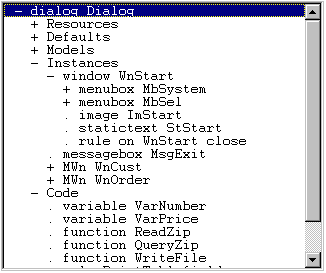
The browser, starting from the dialog or module, displays the objects in their parent-child relationship. The children are represented in the order which the user has been defined, including event rules which can be recognized as children of the object. Die The hierarchical view contains the entire dialog structure, imports, resources, rules, event rules, functions and variables included. This view is subdivided into the following parts according to the scheme in the individual edit windows (chapters 5-8):
-
Resources
Further subdivisions into individual resource types such as accelerator, colors, cursors, fonts, texts, tiles and formats.
-
Defaults, Models, Instances
In this structure all hereditary objects in their default setting, their models and derived instances can be seen. Event rules are visible as children of the object.
-
Code
This section includes all dynamic parts of the dialog and parts not depending on objects or modules: variables, named rules, functions and applications.
The subdivisions themselves may be used as target objects of processing functions such as "Instanciate" or "Edit", as they represent a specific object class.
In the tutorial dialog example, the hierarchical view has about the following structure:
Inheritance view

This view displays the inheritance chain of the objects defined in the module/dialog. Starting from the default object, all models and instances - including the event rules - are visible.
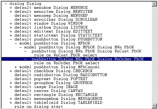
The figure above, for example, displays the default object for a pushbutton, the pushbutton models MPbOk and MPbCancel and the instanciations in the windows WnCust and WnOrder an.
Structure
The object browser is structured with lines. Each line corresponds to an object or to a division. After each line there might be an additional sub-tree, i.e. the object may have children. The user may determine which sub-trees he would like to see in order to keep the necessary subdivisions open. This open state is continued during editor runtime and will thus be available also after switching to the other view or after changing the dialog.
Format of a line in the object browser
( + | - | . ) Type Identifier
The first character indicates the state of the sub-tree:
|
+ |
object has children, but sub-tree is not open |
|
- |
object has children, sub-tree is open and children of the object are visible |
|
. |
object has no children |
The type is either the division name in a hierarchical view, the class or the model of an object, or specifies the "hierarchical model name" which is marked by "."
In the hierarchical view the identifier and the object type are unambiguous locally, i.e. there are no path indications in case of ambiguity. In the inheritance view the type and the identifier must be unambiguous globally, i.e. they are indicated with the complete path. Additionally the type is preceded by the scope, either "default" or "model".
Functionality
The object browser offers the operations which are known from the toolbar and from the artworks. Furthermore most of the objects may also be called via a popup menu.
- Select: selects source or target object for an edit or menu function. However, there is no selection of the object to be processed.
- Double select: opens or closes sub-tree.
Pop-up Menu
By using the menu key in the object browser, you will get the following menu:
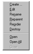
The menu functions are identical with the edit functions from chapter 4.1, but also offers additional functions:
-
Open
This function makes the sub-tree visible, displaying the direct children of the objects.
-
Open All
The entire sub-tree including all the sub-trees is opened. By using this function the entire hierarchy can be displayed.
-
Close
This function makes the sub-tree invisible. The open state of the sub-trees is maintained.
 Support