2.349 .style[enum]
This attribute controls certain presentation chracteristics of the progressbar and treeview.
-
Data type
boolean
-
Access
get, set
-
changed event
yes
-
C
Data type: DT_boolean
-
COBOL
Data type: DT-boolean
-
Classification
object-specific attribute
-
Objects
The attributes determines the appearance of the progress indicator.
Index Range
- style_continuous
-
Defines whether the progress indicator is drawn continuously (true, default value) or as blocks (false).
Note on the IDM for Qt
.style[continuous] is not supported. Qt draws the progress bar depending on the used UI style (
cleanlooks
,plastique
etc.). By default, a continuous bar is drawn in which a subdivision is indicated by color change. However, once you set .fgc, the bar will be drawn continuously in that color. - style_labeled
-
Defines whether the progressbar is labeled with a integral percentage value (true, default) or not (false).
The label is only displayed with horizontal direction of the progressbar.
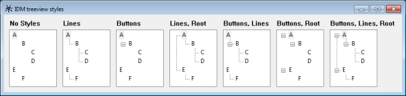
This attribute controls several characteristics of the treeview presentation. All these characteristics are turned off by default.
Index Range
- style_buttons
-
All nodes, except for the top-level nodes, are prefixed with a +/- button to expand and collapse the sub-tree.
- style_lines
-
Lines are drawn between parent and child nodes.
- style_root
-
Together with style_lines, lines are drawn between the top-level nodes.
Together with style_buttons, the top-level nodes are prefixed with +/- buttons too.
The screenshot below shows the appearances produced by the different styles and their combinations.
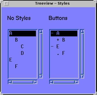
Remark
The three styles are only supported by the IDM for Microsoft Windows. The textual simulation of the treeview on other platforms just offers the setting .style[style_buttons]. This is similar to the treeview labeled “Buttons, Root” in the screenshot above. “+” and “-“ here as well are used to display expanded and collapsed nodes with children; “.” is used to display nodes without children.