28 progressbar
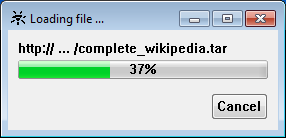
The progressbar object enables to represent the process of a long lasting action visually. For this a kind of bar is shown, whose length is adapted to the progress of the action. Thereby the user can estimate how far the action has advanced and how long it will last.
Definition
{ export | reexport } { model } progressbar { <Identifier> }
{
  <standard attributes>
  <plain attributes>
  <geometry attributes>
  <hierarchy attributes>
  <layout attributes>
  <object-specific attributes>
}
Events
Children
Parents
Menu
28.1 Attributes
28.2 Specific Attributes
| Attribute | Description |
|---|---|
|
Defines the position of the progressbar. See chapter “Calculation of the Progressbar”. |
|
|
defines the style, i.e. representation and characteristics of the borders (since IDM version A.06.01.a) Attribute is supported, but only border_none and border_toolkit are permitted. border_plain, border_raised and border_sunken are mapped to border_toolkit. |
|
|
Width of the object border. On Microsoft Windows a standard border appears if the value of the attribute is greater than 0. Therefore it can only be defined if the border appears or not. The width cannot be influenced. |
|
|
Direction of the progressbar. 1 means vertical direction, the bar proceeds from bottom to top. 2 means horizontal direction, the bar proceeds from the left to the right. |
|
|
Maximum value of the progress indicator. See chapter “Calculation of the Progressbar”. |
|
|
Minimum value of the progress indicator. See chapter “Calculation of the Progressbar”. |
|
|
Options of the object. |
|
|
Appearance of the progress indicator. |
|
|
Color of the label (provided that it is supported by the system), with null the default value of the system is used. |
28.3 Calculation of the Progressbar
The attribute .curvalue specifies the position of the progress indicator. Furthermore this value is used to calculate an percentage value that may be displayed optionally.
If the value is equal to .minvalue, the progress indicator is invisible and the percentage value is 0%. If the value is equal to .maxvalue , the progress indicator covers the entire bar area and the percentage value is 100%. The values in between are calculated accordingly. The progress indicator grows always from left to right or from bottom to top, no matter if .minvalue is larger or smaller than .maxvalue.
28.4 Notes for the Progressbar on Microsoft Windows
Note for active Visual Styles
:
The coloring of Visual Styles
cannot be adjusted to the color set. To avoid inapplicable color combinations, it is recommended to omit setting colors.
Especially it is discouraged to use .fgc with the progressbar (as this would lead to a display of the progressbar with a wide border caused by Visual Styles
).
28.5 Differences and special features Qt
The option .option[continuous] is not supported. Qt draws the progress bar depending on the used UI style (cleanlooks
, plastique
etc.). By default, a continuous bar is drawn in which a subdivision is indicated by color change. However, once you set .fgc, the bar will be drawn continuously in that color.
The .borderwidth attribute is not supported.
The attribute .textfgc is applied. As soon as the bar runs under the caption, the font is displayed in the background color .bgc.
The progressbar with .value = .minvalue displays a small piece of the bar on the left and the text 0%
. It is only displayed completely empty if .value = -1. Then, however, no value is displayed in percent.
28.6 Example
dialog D {}
...
import M1  "m1.if"  { .load false; }
import M2  "m2.if"  { .load false; }
import M3  "m3.if"  { .load false; }
import M4  "m4.if"  { .load false; }
import M5  "m5.if"  { .load false; }
import M6  "m6.if"  { .load false; }
import M7  "m7.if"  { .load false; }
import M8  "m8.if"  { .load false; }
import M9  "m9.if"  { .load false; }
import M10 "m10.if" { .load false; }
...
window WnModLoad
{
  .title  "Modules are loaded ...";
  .width  300;
  .height 100;
  .dialogbox   true;
  .sizeable    false;
  .closeable   false;
  .iconifyable false;
  .borderwidth 1;

  progressbar PrModLoad
  {
    .xauto   0;
    .yauto   0;
    .xleft   5;
    .xright  5;
    .ytop    10;
    .ybottom 10;
    .style[style_continous] false;

    .minvalue 0;
    .maxvalue 10;
    .curvalue 0;
  }
}
...
on dialog start
{
  M1.load := true;
  PrModLoad.curvalue := 1;
  M2.load := true;
  PrModLoad.curvalue := 2;
  M3.load := true;
  PrModLoad.curvalue := 3;
  M4.load := true;
  PrModLoad.curvalue := 4;
  M5.load := true;
  PrModLoad.curvalue := 5;
  M6.load := true;
  PrModLoad.curvalue := 6;
  M7.load := true;
  PrModLoad.curvalue := 7;
  M8.load := true;
  PrModLoad.curvalue := 8;
  M9.load := true;
  PrModLoad.curvalue := 9;
  M10.load := true;
  PrModLoad.curvalue := 10;
  WnModLoad.visible := false;
  ...
}
 Support