30 radiobutton
The radiobutton is a type of button that can be used to select an item out of a group of options (either/or). Only one radiobutton can be selected. If another one is selected, the state belonging to the previously selected radiobutton will be deleted.
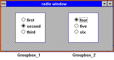
By selecting a radiobutton, all radiobuttons on the same hierarchical level are deselected. If more than one radiobutton is to be selected at the same time in one window, their direct parents have to be different. This can be achieved by using groupboxes in which these groups of radiobuttons are located.
Definition
{ export | reexport } { model } radiobutton { <Identifier> }
{
  <standard attributes>
  <plain attributes>
  <geometry attributes>
  <hierarchy attributes>
  <layout attributes>
  <text attributes>
  <object-specific attributes>
}
Events
Children
Parent
Menu
30.1 Attributes
|
Attribute |
RLD |
PID |
Properties |
Short Description |
|---|---|---|---|---|
|
string object |
string text |
S.G/D/C |
overwrites the Automation Identifier for Microsoft UI Automation |
|
|
object string |
text string |
S.G/D/C |
overwrites the Automation Name for Microsoft UI Automation |
|
|
identifier |
accel |
S,G/D/C |
accelerator of object |
|
|
boolean |
boolean |
S,G/D/C |
activation state of an object |
|
|
identifier |
color |
S,G/D/C |
background color |
|
|
class |
class |
-,G/-/- |
class/id of object |
|
|
identifier |
instance |
-,G/-/- |
control currently belonging to object |
|
|
identifier |
cursor |
S,G/D/C |
cursor belonging to object |
|
|
identifier |
instance |
-,G/-/- |
dialog to which the object belongs |
|
|
object |
document |
S,G/-/- |
accesses the I-th XML Document |
|
|
boolean |
boolean |
-,G/-/- |
returns if the object class is an USW class |
|
|
class |
class |
-,G/-/- |
returns the I-th registered USW class |
|
|
identifier |
color |
S,G/D/C |
foreground color |
|
|
object |
record |
S,G/-/C |
accesses the first record of an object |
|
|
boolean |
boolean |
S,G/-/C |
input focus on object |
|
|
identifier |
font |
S,G/D/C |
object font |
|
|
identifier |
func |
S,G/D/C |
function belonging to object |
|
|
identifier |
instance |
-,G/-/- |
object groupbox |
|
|
integer |
integer |
S,G/D/C |
object height |
|
|
string identifier |
string text |
S,G/D/C |
help text of object |
|
|
integer index |
integer index |
-,G/-/- |
current index of object in the child list of its parent |
|
|
string |
string |
S,G/D/C |
name/identifier of object |
|
|
object |
record |
S,G/-/C |
accesses the last record of an object |
|
|
object |
object |
S,G/-/C |
layoutbox of object |
|
|
boolean |
boolean |
S,G/D/- |
defers the display of a visibly created object |
|
|
attribute |
attribute |
-,G/-,- |
user-defined attribute [I] of object |
|
|
integer |
integer |
-,G/-,- |
number of user-defined attributes |
|
|
identifier |
instance |
S,G/D/C |
object menu |
|
|
identifier |
instance |
S,G/D/C |
model belonging to object |
|
|
boolean |
boolean |
S,G/D/- |
special options of object |
|
|
identifier |
instance |
S,G/-/- |
parent of object |
|
|
boolean |
boolean |
S,G/D/C |
positions refer to grid |
|
|
integer |
integer |
-,G/-/- |
real height of object |
|
|
boolean |
boolean |
-,G/-/- |
real selectivity of object |
|
|
boolean |
boolean |
-,G/-/- |
real visibility of object |
|
|
integer |
integer |
-,G/-/- |
real width of object |
|
|
integer |
integer |
-,G/-/- |
real distance from left (in pixel) |
|
|
integer |
integer |
-,G/-/- |
real distance from top (in pixel) |
|
|
object |
record |
S,G/-/C |
accesses the I-th record of an object |
|
|
integer |
integer |
-,G/-/- |
queries the number of child records |
|
|
integer |
scope |
-,G/-/- |
queries the object type (Default, Model or instance) |
|
|
boolean |
boolean |
S,G/D/C |
selectivity of object |
|
|
boolean |
boolean |
S,G/D/C |
size refers to grid of parent object |
|
|
string object |
string text |
S,G/-/C |
text to be displayed in statusbar |
|
|
string identifier |
string text |
S,G/D/C |
static text of object |
|
|
object |
object |
-,G/-/- |
toolbar of object |
|
| .toolhelp |
string object |
string text |
S,G/D/C |
gives a short explanation of object at the cursor |
|
anyvalue |
anyvalue |
S,G/D/C |
object userdata (any DM datatype) |
|
|
boolean |
boolean |
S,G/D/C |
visibility of object |
|
|
integer may be 0 |
integer |
S,G/D/C |
actual width of object |
|
|
identifier |
instance |
-,G/-/- |
window to which object belongs |
|
|
integer (-1, 0, 1) |
integer |
S,G/D/C |
definition type of x-coordinates |
|
|
integer |
integer |
S,G/D/C |
x-coordinate, distance from left |
|
|
integer |
integer |
S,G/D/C |
x-coordinate, distance from right |
|
|
integer (-1, 0, 1) |
integer |
S,G/D/C |
definition type of y-coordinates |
|
|
integer |
integer |
S,G/D/C |
y-coordinate, distance from bottom |
|
|
integer |
integer |
S,G/D/C |
y-coordinate, distance from top |
30.2 Specific Attributes
The attribute .active defines the on
state (.active = true) or the off
state of the radiobutton.
Plain Attributes
These attributes define the size and position of the radiobutton. If .height or .width is specified as 0, the DM calculates the size of the radiobutton on the basis of the actual font.
The attribute .options can have the following values:
|
option_index |
Meaning |
|---|---|
|
opt_use_widget |
Radiobutton is displayed as widget. (on Motif only) |
|
opt_push_like |
Radiobutton is displayed like a pushbutton. (on Microsoft Windows only) |
30.3 Notes on the radiobutton under Microsoft Windows
- Under Microsoft Windows a radiobutton gets activated when it obtains the focus. If an activated radiobutton gets insensitive, the focus moves to the next radiobutton, activating that one. Therefore it should be avoided to set the activated radiobutton insensitive.
- Concerning the background color, please refer to the notes on attribute .bgc in the “Attribute Reference”.
30.4 Example
Two groups of radiobuttons in one window.
window Radiowindow
{
child groupbox Group_1
{
child radiobutton First
{
}
child radiobutton Second
{
}
child radiobutton Third
{
}
}
child groupbox Group_2
{
child radiobutton Four
{
}
child radiobutton Five
{
}
child radiobutton Six
{
}
}
}
 Support