42 toolbar
As implied by its name, the toolbar object is a grouping object with the main purpose to define toolbars. Only windows can have one or more toolbars as children.
A toolbar can either be docked to its parent window or appear as a separate tool window.
The background color of toolbars is that of the menus; the child objects do not have focus frames and can only be operated by mouse or accelerators. The frame around a docked toolbar shows its scope.
Definition
{ export | reexport } { model } toolbar { <Identifier> }
{
  <standard attributes>
  <plain attributes>
  <geometry attributes>
  <hierarchy attributes>
  <layout attributes>
  <object-specific attributes>
}
Events
(only for undocked toolbars) (only for undocked toolbars)Children
Parents
Menu
The following schematic picture of a window illustrates the arrangement of the several areas. Adding and removing toolbars does not change the size of the window but affects the size of the client area where the actual contents of the window are displayed.
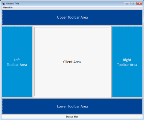
One toolbar area can contain one or more toolbars, which can be arranged on several rows or columns (exclusively). The size of a toolbar area depends on the number, sizes and distribution of the toolbars within; there cannot be rows or columns without at least one toolbar in it.
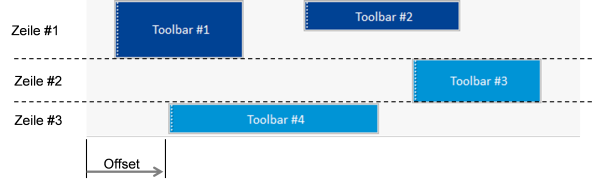
The offset is measured from the left or top edge of the toolbar area, depending on whether it is a horizontal (dock_up, dock_down) or a vertical (dock_left, dock_right) toolbar.
With docked toolbars move events only occur when the attributes .dock_offset or .dock_line change. As an example there is no move event when a docked toolbar is moved down but remains in the same toolbar row. Indirect changes of .dock_offset or .dock_line, caused for instance through resizing another toolbar, are only performed transiently without altering the defined positions persistently. Therefore toolbars take back their defined positions once the required space becomes available.
42.1 Attributes
42.2 Specific Attributes
A particularity of the toolbar-specific attributes is that they heavily influence each other. Most inherited attributes behave like on the other objects, e.g. the window.
Toolbar-specific features of the respective attributes are described in the table below and the next sections.
| Attribute | Description |
|---|---|
Toggles the automatic positioning of the object after the last toolbar or at the beginning of the row or column. | |
Defines whether the toolbar shall be enlarged in the respective dimension to cover the entire toolbar row or column. | |
Determines how geometry is computed when a grid is used. Only effective for .borderwidth > 0 or .docking = dock_window. | |
defines the style, i.e. representation and characteristics of the borders (since IDM version A.06.01.a) Attribute is supported, but only border_none and border_toolkit are permitted. border_plain, border_raised and border_sunken are mapped to border_toolkit. | |
Controls in which toolbar areas a toolbar can be docked. Possible indexes:
| |
Sets or returns the current docking position of the toolbar. Possible values:
With instances it is only allowed to set values for which the attribute .dockable[enum] is true. | |
Defines the order of toolbars within one toolbar area. | |
Sets the distance of the toolbar from the left or top edge of the toolbar area. | |
Defines if a mouse click into the client area of the object activates the object, i.e. sets the focus on it (Microsoft Windows only). See also chapter “.focus_on_click”. | |
Height of the object. See chapter “.height, .width” for specifics concerning inheritance. | |
Height of the object in a specific state. Indexes: toolbar, window. See also chapter “.height[class], .width[class]”. | |
Maximum height of the object. See also chapter “.minwidth, .maxwidth, .minheight, .maxheight”. | |
Maximum width of the object. See also chapter “.minwidth, .maxwidth, .minheight, .maxheight”. | |
Minimum height of the object. See also chapter “.minwidth, .maxwidth, .minheight, .maxheight”. | |
Minimum width of the object. See also chapter “.minwidth, .maxwidth, .minheight, .maxheight”. | |
Options of the toolbar; please refer to the “Attribute Reference” for details. | |
Defines if the toolbar can be resized interactively; the default value is true. See also chapter “.sizeable and .sizeable[class]”. | |
Defines if the toolbar can be resized interactively when it is in a specific state. Indexes: toolbar, window. See also chapter “.sizeable and .sizeable[class]”. | |
Sets a background image for the object. | |
Controls how the background image set in .tile is arranged. | |
Title of the tool window when the toolbar is undocked. | |
Toggles whether the tool window of an undocked toolbar has a title bar. | |
Width of the object. See chapter “.height, .width” for specifics concerning inheritance. | |
Width of the object in a specific state. Indexes: toolbar, window. See also chapter “.height[class], .width[class]”. | |
Defines the horizontal dimension that will be calculated by IDM. Only effective for tool windows, the attribute is ignored for docked toolbars. | |
Distance from the left edge. Only effective for tool windows, the attribute is ignored for docked toolbars. | |
Distance from the right edge. Only effective for tool windows, the attribute is ignored for docked toolbars. | |
Defines the vertical dimension that will be calculated by IDM. Only effective for tool windows, the attribute is ignored for docked toolbars. | |
Distance from the lower edge. Only effective for tool windows, the attribute is ignored for docked toolbars. | |
Distance from the upper edge. Only effective for tool windows, the attribute is ignored for docked toolbars. |
42.2.1 .dockable, .docking[enum]
For the attributes .dockable and .docking[enum] inheritance to instances is ignored in cases it would lead to inconsistencies.
This also applies if inheritance of the .docking attribute would change the size attributes of the parent window and the parent window of the toolbar is visible but not sizeable.
Nevertheless the inheritance relations persist, meaning that no call of setinherit() is necessary to pass down future value changes from the model.
42.2.2 .focus_on_click
With the attribute .focus_on_click a toolbar can be defined that does not pull the focus out of the related window when the toolbar is clicked with the mouse. As in the ISA Dialog Manager all sensitive child objects of the toolbar may also obtain the focus, the attribute is available for the objects groupbox, image, rectangle and statictext too. Take into consideration that a grouping object with .focus_on_click = false should not contain objects, which may gain the focus or even require it for input (e.g. edittext).
The attribute can only be used on Microsoft Windows.
42.2.3 .height, .width
These attributes are the defaults for .height[class] and .width[class]. The attributes .height and .width therefore act like other predefined or user-defined attributes that have default values. The respective sizes can be set simultaneously for the docked and undocked states. Also changed events are triggered for these attributes.
For docked toolbars in visible but not sizeable parent windows, the heights of horizontally docked toolbars and the widths of vertically docked toolbars cannot be changed as this would change the .width or .height attributes of the parent windows.
42.2.4 .height[class], .width[class]
The attributes .height[class] and .width[class] specify the heights and widths of a toolbar in its docked (class = toolbar) and undocked (class = window) states. When theses sizes are changed while the toolbar has the corresponding state, changed events are triggered for the affected attributes, with the respective index though.
42.2.5 .minwidth, .maxwidth, .minheight, .maxheight
These attributes have the same meanings as those of the window object and are effective in the docked as well as in the undocked states. If applicable they have to be adapted when a toolbar is moved to another docking area (e.g. from the top to the right).
42.2.6 .sizeable and .sizeable[class]
The .sizeable[class] attribute prevents a toolbar from being interactively resized by the user. It is a vector attribute like .height[class] with a default value in .sizeable. The possibility of interactive resizing can be set individually for docked and undocked state whereas .sizeable affects both states.
42.2.7 .xleft, .xright, .xauto, .ytop, .ybottom, .yauto
These attributes are only effective for tool windows and are ignored with docked toolbars.
42.3 Interactive Handling
The child objects of a toolbar behave like in a window.
Handling of toolbars allows interactive closing, moving and resizing of tool windows with the mouse or by means of the system menu; regardless of the docking state, the docking state of a toolbar can be toggled by double-clicking the left mouse button in a free area or the non-client area of the toolbar.
If the docking state is toggled by double-click, the toolbar jumps to the position it had the last time in that docking state. Toolbars that are docked for the first time get docked at the top by default.
Interactive docking and undocking can be locked through the .dockable attribute. If the parent window is visible and not sizeable it is also impossible to dock or undock toolbars.
The handle of a docked toolbar has no function yet.
42.4 Interactive Toolbar Resizing
For the resizing of objects there is the .sizeable attribute. This also exists for the toolbar but is only effective in the undocked state (similar to the window). The following deals with the resizing of docked toolbars.
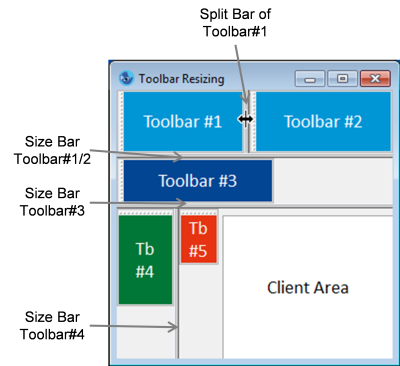
Every docked toolbar whose size can be changed provides bars for resizing. Bars that separate consecutive toolbars within one row or column will be called split bars in the following. In contrast, bars that influence the height of a toolbar row or the width of a toolbar column will be called size bars. Moving size bars typically affects several other toolbars and the size of the client area. Moving a split bar at first only affects the size of the respective toolbar but may have an impact on other toolbars in the same row or column as well as on the client area (cue: wrap).
In the picture above all toolbars but the smallest toolbar #5 can be resized. Thus the following split bars and size bars exist:
- Size bars at the right or the bottom of a toolbar (depending on its direction), except for last toolbar in a row or column.
- Split bars if a toolbar can be resized within a row or column. The split bars are located at the edge of the toolbar that is closest to the client area.
The bars are handled like the splt bars of the splitbox, which means:
- As visual feedback the cursor shape changes when the mouse cursor is over a bar (bidirectional horizontal or vertical arrows).
- When the left mouse button is pressed and held down over the bar, a dimmed bar appears which follows the moves of the mouse within a toolbar row or column.
- The toolbar is finally resized when the mouse button is released.
A resize event is triggered when the size of a toolbar has changed (that is the width or height attribute has changed).
Minimum and maximum values are only taken into account with sizeable toolbars, leading to this behavior:
- Interactive resizing: A toolbar row or column can never be smaller than the largest minimum size and never be larger than the smallest maximum size. Exceptional cases are conflicting minimum and maximum sizes or window sizes which prohibit the defined behavior.
- Of course the values influence the arrangement and layout of toolbars.
42.4.1 Automatic Sizing and Positioning of Toolbars
Toolbars provide two additional features:
.autoalign = true
Automatically places a docked toolbar after the last toolbar in a row or column or at the beginning of empty rows and columns.
.autosize = true
Automatically enlarges toolbars to cover the entire row or column. Beginning with the last toolbar in a row or column, toolbars are expanded if empty space is available, regardless of .sizeable. Expansion is limited to the docking direction: width is increased for horizontal direction and height for vertical direction.
42.5 Coordinates and Sizes
The toolbars and the free space between them constitute the toolbar area of the parent window. This area is located outside the client area of the window and is visually separated from it by a border. Menu and statusbar, if present, are placed further outside than the toolbar area, scrollbars further inside. The priority of overlapping toolbars is top to bottom first and then left to right.
Toolbars support size and position grids. If size raster is turned on for the parent window, the toolbar areas are expanded to fit grid units. This may cause gaps between the toolbars and the borders of the toolbar area.
In visible windows docking, undocking, and changing the docking position of toolbars, creating or destroying, showing or hiding, and resizing of docked toolbars lead to an adjustment of the parent window’s client area. That is, for the parent window the values of the attributes .width and .height change. This prevents the window from jumping
when toolbars are docked or undocked interactively. Hence a resize event is triggered for the window (of course a move event for the toolbar is triggered too).
If the window is invisible, the size of its client area remains the same, rather the outer dimensions of the window are changed.
There are exceptions to this general behavior:
- If the parent window is visible but not sizeable, no toolbars can be docked or undocked. But attention, as in general the following is valid: when toolbars are manipulated from the Rule Language, the client area of the parent window may change even if the window is not sizeable.
- When minimum or maximum sizes are set for the parent window and these values would be violated by undocking or destroying, docking or creating a toolbar, contrary to the standard behavior the outer dimensions of the window are adjusted as far as necessary.
- If no maximum attributes but a virtual size is set for the parent window, undocking or destroying a toolbar may cause the outer dimensions of the window to be reduced in order to prevent the client area from exceeding the virtual size.
42.6 Particularities with Focusing
Important: In contrast to other toolbars, objects in a IDM toolbar can obtain the focus. On Microsoft Windows this feature can be controlled through the .focus_on_click attribute for the toolbar as well as for the objects groupbox, image, rectangle and statictest. The attribute does not exist on Motif.
In general the focus behavior of the toolbar is quite similar to that of the window object.
A undocked toolbar (tool window) can be activated with a mouse click. This moves the focus to the toolbar child that had it the last time the toolbar was active. If no child ever had the focus, the first child obtains it. In a toolbar without children, no object will be focused, which shows through no object on the screen possessing a focus frame.
A docked toolbar cannot be activated as in this case the parent window is active. However it is possible to set the focus on the toolbar with a mouse click, or to be more accurate, to set the focus on one of the toolbar children. With regard to which child will receive the focus, the same rules as for undocked toolbars apply. If the toolbar has no children, the focus moves to or remains at a child of the parent window. In this situation the toolbar cannot obtain the focus.
To preserve the focused object in a docked toolbar when the window is activated, the attribute .focus_on_click of the toolbar must be set to true. Anyhow a mouse click into the client area of the parent window shifts the focus to a child of the parent window.
As customary, within a toolbar the focus can be moved from one child to the next with the Tab key. The sequence is determined through the order in which the children were generated in the dialog. When the last child is reached, the focus jumps back to the first child.
When the focus is on a child object of a toolbar and the toolbar becomes insensitive, the previously active window is activated again and the focus shifts to a child of this window or the window itself if it has no children.
42.7 Remark Windows 10 and 11 with multiple monitors
In Windows, after adding/removing a monitor or changing the display settings, you may encounter the following problems:
- No moving frame appears when moving a toolbar object. It can also happen that a rectangle the size of the toolbar frame is displayed with an incorrect background on another monitor.
- Undocked toolbar objects do not adjust to changes in DPI value. Both when moving to another monitor or changing the magnification.
The problem is due to Windows, which on the one hand incorrectly converts the coordinates when drawing to the desktop and on the other hand does not send important messages (WM_DPICHANGED) to so-called tool windows and does not change the window DPI value.
After the screen saver was active or you logged in again (and after a reboot), the problem no longer occurs.
42.8 Particularities of the Toolbar on Motif
Undocked toolbars cannot be docked by dragging their titlebar with the mouse.
42.9 Particularities of the Toolbar on Qt
The toolbar can have two different forms on Qt, which are set via the .style attribute. By default, the style toolbar is active, which visually matches the familiar toolbars.
Table 13-4:
Value | Description |
|---|---|
.style = toolbar ( | Conventional toolbar, corresponding to the well-known IDM toolbar. |
.style = notepage | Toolbars use a dock area that lies between toolbars and inner area. |
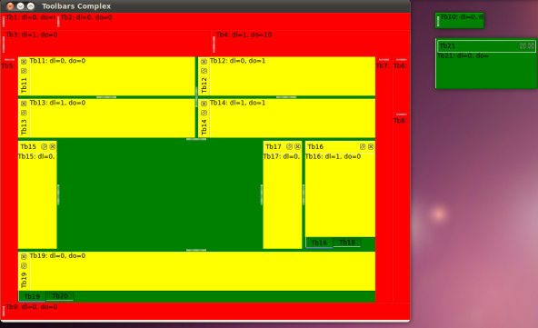
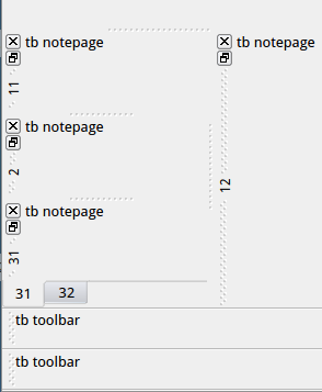
“Figure 13-47” shows the division of a window with different toolbars in the docked and undocked state. Tb16
and Tb18
as well as Tb19
and Tb20
are tabbed toolbars
that share their space. Tb17
is a nested toolbar
embedded in the second row of the right pane.
The style notepage allows to nest multiple toolbars in in one docking area and arrange them as tabs (see chapter “Particularities of the Window on Qt” for the corresponding control options). The toolbars then have a title bar and can be undocked and closed using their title buttons.
Toolbars of different styles defined in the same docking area cannot be mixed and are grouped according to their style. Toolbars with the style toolbar are always positioned at the outer edge of the window and toolbars with the style notepage are always positioned between the client area of the window and the toolbars with the style toolbar (see “Figure 13-48”).
Toolbars cannot be positioned with spaces between them. The attribute .autoalign has no function.
The attribute .sizeable behaves when true like the attribute .autosize, that is, the entire available width or height is filled. If false, the set size is retained under all circumstances.
Undocked toolbars with the toolbar style cannot be resized with the mouse and do not create move events when moved.
Docked toolbars with the style toolbar and .sizeable = true can be manually enlarged in one direction only, depending on their orientation: Horizontal toolbars only in width, vertical toolbars only in height. The size in the other direction is determined by the largest toolbar in the same row or column. A smaller toolbar is automatically adjusted by Qt to the height or width of the highest or widest toolbar. With .sizeable = true it is therefore recommended not to define different heights or widths within a toolbar row or column.
Furthermore, manual enlargement in one direction is only possible at the toolbar junctions.
Toolbars with style notepage and .sizeable = trueignore depending on their orientation the set .width for vertical and the set .height for horizontal orientation. They are always displayed with their minimum width or height. Therefore it is recommended to always set the attribute .minwidth or .minheight, otherwise Qt will use certain default values.
Toolbars are not automatically wrapped in the next row or column if not all of them fit into the given window width or height. Depending on .sizeable the following behavior may occur:
.sizeable = true
Widths respectively heights of the toolbars are ignored by Qt and reduced so that all toolbars fit into the given window width or height.
.sizeable = false
If necessary, Qt automatically increases the width or height of the window to provide space for all toolbars of a row. Thus the set window width or height will be overridden by Qt.
A new row or column can only be forced through the .dock_line attribute.
For toolbars with the notepage style, positioning depends on the opt_nested_docks and opt_tabbed_docks window options. If both options are deactivated (default), then .dock_line is ignored and all toolbars are arranged side by side (horizontal) or one above the other (vertically).
If the option opt_nested_docks is active, then .dock_line is considered. Nesting is always relative to the previous toolbar of the same docking area. In “Figure 13-49” the toolbars eins
, zwei
and drei
each have .dock_line = 1, vier
has .dock_line = 2 and is embedded into „drei
“.
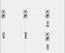
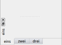
If the opt_tabbed_docks option is active, all toolbars with the same .dock_line are displayed as consecutive tab pages (“Figure 13-50”).
Depending on the UI style, no boundary from the client area may be displayed for .style = notepage.
When switching between horizontal and vertical docking, the width and height are not reversed, because depending on the type of the toolbar, changes of orientation may already occur during the move.
The attributes .height[] and .width[] are only supported and applied in the notepage style.
42.9.1 Behavior
With tabbed toolbars
, activating a tab or the associated visualization sends an activate event (similar to notebook and notepage).
Sending events such as activate, deactive, close, move and resize strongly depends on the Qt toolbar object in use. Internal states such as User is still dragging
cannot be taken into account.
“Table 13-5” summarizes the differences and limitations of the toolbar in the IDM for Qt.
Table 13-5:
.style | Conditions | Limitations and Differences |
|---|---|---|
all |
| .autoalign is not supported. |
all | .sizeraster = true | Toolbar area is not adjusted to grid size. |
all | .dock_offset > 0 | Toolbars cannot be positioned at a distance (whitespace). |
notepage |
| .max_height, .max_width, .min_height, and .min_width have no effect. |
toolbar | .sizeable = true | No size bar; toolbar size can only be influenced in one direction (depending on the docking position). The size in the other direction is determined by the maximum width or height. Behavior corresponds to .autosize = true. |
toolbar | .sizeable = true | Toolbar size cannot be changed. |
toolbar | .autosize = true | Maximum possible width or height. |
toolbar | .docking <> dock_window | Minimum and maximum sizes do not affect the overall size of the toolbar, but cut content or create empty areas. |
toolbar |
| No activate and deactivate events. |
toolbar | No moveevents. |
42.10 Miscellaneous
The child objects of toolbars have to be arranged manually, even in the case of changing the docking position. It is recommended to hide a toolbar before changing its docking position from the Rule Language. Then the child objects can be rearranged before the toolbar is made visible in the new docking position.
Accelerators for the child objects of toolbars also work in the parent window. If the same accelerators are defined in the parent window they take priority over those of the toolbar children.
42.11 Example
dialog D
font Fn "12.Arial",0,bold;
color ColWhite "White", grey(100), white;
!! color ColBlue "Blue", grey(100), white;
source SrcCut
{
0: .action action_cut;
.type type_object;
}
source SrcCopy
{
0: .action action_copy;
.type type_object;
}
target Tar
{
0: .action action_paste;
.type type_object;
}
tile Ti_Other 20,20,
"####################",
"# # #",
"# # ### #",
"# # # #",
"# # #",
"####################",
" ",
"####### ",
"## ## ### #### ",
"# # # # # # # #",
"# # # ##### #### ",
"# # # # # # # #",
"## ## # # #### ",
"####### ",
" ",
"####################",
"# #",
"# ### #### #### #",
"# ### #### ## #",
"####################";
tile Ti_Person 20,20,
" ### ## ",
" ## ########",
" # # ########",
" # # ########",
" # # ########",
" # # ########",
" ## ### ##",
" ## # ",
" # # # ",
" ## ###### ",
" # # # # ",
" # # # # ",
" # # # ",
" #### # ",
" # # # ",
" # # # ",
" # # # ",
" ### ### # ",
" # ",
" # ";
tile TiUp 24,16,
"########################",
"########################",
"# ## ## ## ## ## ## ## #",
"########################",
"# #",
"# #",
"# #",
"# #",
"# #",
"# #",
"# #",
"# #",
"# #",
"# #",
"# #",
"########################";
tile TiLeft 24,16,
"########################",
"########################",
"# # #",
"### #",
"### #",
"# # #",
"### #",
"### #",
"# # #",
"### #",
"### #",
"# # #",
"### #",
"### #",
"# # #",
"########################";
tile TiRight 24,16,
"########################",
"########################",
"# # #",
"# ###",
"# ###",
"# # #",
"# ###",
"# ###",
"# # #",
"# ###",
"# ###",
"# # #",
"# ###",
"# ###",
"# # #",
"########################";
tile TiDown 24,16,
"########################",
"########################",
"# #",
"# #",
"# #",
"# #",
"# #",
"# #",
"# #",
"# #",
"# #",
"# #",
"# #",
"########################",
"# ## ## ## ## ## ## ## #",
"########################";
tile TiWin 24,16,
"################## ",
"################## ",
"################## ",
"# # ",
"# # ",
"# # ",
"# # ",
"# # ",
"# # ",
"# # ",
"# ###################",
"# ###################",
"###### #",
" # ### ### ### ### #",
" # #",
" ###################";
default image
{
.width 32;
.height 32;
on cut
{
variable object Parent := this.parent;
if (Parent.class = toolbar) then
destroy (this);
Pos(Parent, Parent.docking);
endif
}
}
model image MImUp
{
.picture TiUp;
on select
{
Pos(this.parent,dock_up);
}
}
model image MImDown
{
.picture TiDown;
on select
{
Pos(this.parent,dock_down);
}
}
model image MImLeft
{
.picture TiLeft;
on select
{
Pos(this.parent,dock_left);
}
}
model image MImRight
{
.picture TiRight;
on select
{
Pos(this.parent,dock_right);
}
}
model image MImWindow
{
.picture TiWin;
on select
{
Pos(this.parent,dock_window);
}
}
!! -----------------------------------------------------
!! --------------- Model Listbox -----------------------
!! -----------------------------------------------------
model listbox MLbTitle
{
.ytop 2;
.xleft 5;
.height 100;
.width 150;
.font Fn;
.content[1] "Title";
.content[2] "Toolbar";
.content[3] "Heading";
on cut
{
variable object Parent := this.parent;
if (Parent.class = toolbar) then
destroy (this);
Pos(Parent, Parent.docking);
endif
}
on select
{
variable object Parent := this.parent;
if (Parent.class = toolbar) then
Parent.title := this.content[this.activeitem];
endif
}
rule void CopyContent(object This)
{
variable integer I;
for I:=1 to this.itemcount do
This.content[I] := this.content[I];
endfor
}
}
!! -----------------------------------------------------
!! --------------- Model Poptext -----------------------
!! -----------------------------------------------------
model poptext MPt
{
.xleft 156;
.width 192;
.ytop 31;
.text[1] "Option 1";
.text[2] "Option 2";
.text[3] "Option 3";
.text[4] "Option 4";
on cut
{
variable object Parent := this.parent;
if (Parent.class = toolbar) then
destroy (this);
Pos(Parent, Parent.docking);
endif
}
rule void CopyContent(object This)
{
variable integer I;
for I:=1 to this.itemcount do
This.content[I] := this.content[I];
endfor
}
}
!! -----------------------------------------------------
!! --------------- Model Pushbutton --------------------
!! -----------------------------------------------------
model pushbutton MPb
{
.xleft 100;
.width 110;
.height 30;
.ytop 57;
.font Fn;
.text "Toolbar";
on cut
{
variable object Parent := this.parent;
if (Parent.class = toolbar) then
destroy (this);
Pos(Parent, Parent.docking);
endif
}
}
!! -----------------------------------------------------
!! --------------- Model Edittext ----------------------
!! -----------------------------------------------------
model edittext MEt
{
.xleft 159;
.width 228;
.ytop 98;
on cut
{
variable object Parent := this.parent;
if (Parent.class = toolbar) then
destroy (this);
Pos(Parent, Parent.docking);
endif
}
}
!! -----------------------------------------------------
!! --------------- Model Toolbar -----------------------
!! -----------------------------------------------------
model toolbar MTb
{
.docking dock_up;
.target Tar;
on paste
{
variable object O;
O := this:AddChild (thisevent.value.model);
if O.model = MLbTitle then
MLbTitle:CopyContent(O);
endif
}
rule object AddChild (object Model)
{
variable object O;
O := create(Model, this);
O.source := SrcCut;
Pos(this, this.docking);
return O;
}
}
!! ------------------------------------------------------------------
!! ----------------- Toolbar Window ---------------------------------
!! ------------------------------------------------------------------
window W {
.xauto 0;
.xleft 0;
.xright 0;
.yauto 0;
.ytop 0;
.ybottom 0;
.vwidth 1000;
.vheight 1000;
.bgc ColWhite;
.vsb_optional false;
.vsb_visible true;
.title "Toolbar Demo";
.font Fn;
child menubox
{
.title "Toolbar";
.font Fn;
child menuitem
{
.text "Setup";
.font Fn;
on select
{
Nb.visible := true;
}
}
child menuitem
{
.text "New Toolbar";
.font Fn;
on select
{
create(MTb,W);
}
}
}
child MTb Tb1
{
.title "Toolbar 1";
.dock_line 1;
.font Fn;
child MPt Pt
{
.font Fn;
}
}
child notebook Nb
{
.xleft 100;
.ytop 100;
.height 300;
.width 400;
.font Fn;
.visible false;
!!
!! ---------------- Notepage 1 ----------------
!! --------------------------------------------
child notepage Np1
{
.target Tar;
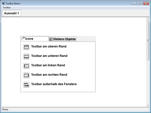
.title "Icons";
.picture Ti_Person;
.font Fn;
child statictext
{
.xleft 50;
.ytop 13;
.text "Toolbar at top edge";
.font Fn;
.sensitive false;
}
child MImUp ImUp
{
.ytop 10;
.xleft 10;
.source SrcCopy;
}
child statictext
{
.xleft 50;
.ytop 63;
.text "Toolbar at bottom edge";
.font Fn;
.sensitive false;
}
child MImDown
{
.ytop 60;
.xleft 10;
.source SrcCopy;
}
child statictext
{
.xleft 50;
.ytop 113;
.text "Toolbar at left edge";
.font Fn;
.sensitive false;
}
child MImLeft
{
.ytop 110;
.xleft 10;
.source SrcCopy;
}
child statictext
{
.xleft 50;
.ytop 163;
.text "Toolbar at right edge";
.font Fn;
.sensitive false;
}
child MImRight
{
.ytop 160;
.xleft 10;
.source SrcCopy;
}
child statictext
{
.xleft 50;
.ytop 213;
.text "Toolbar outside the window";
.font Fn;
.sensitive false;
}
child MImWindow
{
.ytop 210;
.xleft 10;
.source SrcCopy;
}
}
!!
!! ------------------- Notepage 'Objects' ---------------
!!
child notepage Np2
{
.target Tar;
.title "More Objects";
.picture Ti_Other;
child statictext
{
.xleft 10;
.ytop 10;
.text "Listbox";
.font Fn;
.sensitive false;
}
child MLbTitle LBT
{
.ytop 30;
.xleft 10;
.width 150;
.height 100;
.source SrcCopy;
.font Fn;
}
child statictext
{
.xleft 200;
.ytop 10;
.text "Pushbutton";
.font Fn;
.sensitive false;
}
child MPb Pb
{
.xleft 200;
.ytop 40;
.source SrcCopy;
}
}
}
statusbar S
{
statictext
{
.text "Ready";
}
}
on close { exit; }
}
!!
!! -------------------- Notebook ----------------
!!
on dialog start
{
Tb1:AddChild (MImUp);
Tb1:AddChild (MImDown);
MLbTitle:CopyContent(LBT);
}
rule void Pos (object This, enum P)
{
variable integer I;
variable integer X;
variable integer Y;
if (This.class = toolbar) then
case P
in dock_right, dock_left:
Y := 3;
for I:=1 to This.childcount do
if (This.child[I].class <> image ) then
This.child[I].visible := false;
else
This.child[I].xleft := 3;
This.child[I].ytop := Y;
Y := Y + This.child[I].height + 4;
endif;
endfor
in dock_up, dock_down, dock_window:
X := 3;
for I:=1 to This.childcount do
This.child[I].visible := true;
This.child[I].ytop := 3;
This.child[I].xleft := X;
X := X + This.child[I].width + 4;
endfor
endcase
This.docking := P;
if (P = dock_window) then
This.height := 100;
This.width := 400;
endif
endif
}
This example produces the image below.
 Support