19 layoutbox
The layoutbox is a grouping object in which the objects and user interface components that are to be arranged can be thrown into. They are then automatically arranged.
Definition
{export | reexport} { model } layoutbox { <Identifier> }
{
  <standard attributes>
  <geometry attributes>
  <hierarchy attributes>
  <layout attributes>
  <object-specific attributes>
}
Events
Children
Parents
Menus
19.1 Using the layoutbox
Often one is faced with the problem that objects or user interface components must be arranged. It is possible to do this by hand, however it is laborious and error-prone when some of the objects change in position or size.
The layoutbox can be of help in such situations. It is a grouping object in which the objects and user interface components that are to be arranged can be thrown into. They are automatically arranged without overlapping according to their sequence in the child vector.
The layoutbox tries to arrange the objects one after the other. If an object does not fit into a row or column anymore, it will be automatically placed in the next one.
In addition, it is ensured that all objects are accessible, i.e. when not all objects can be placed in the visible area (e.g. because the parent window is too small) scrollbars are displayed. The virtual sizes of layoutboxes are always set, provided that .wrap is true. They cannot be influenced but be queried to determine the size of the working area. The virtual sizes can be smaller or larger than the real sizes of the layoutbox.
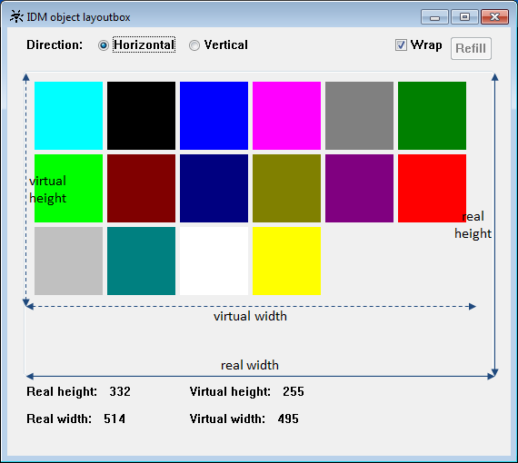
The column width or row height is always determined by the widest or highest object in the respective column or row. All other objects are aligned accordingly.
When objects are arranged row-by-row, .yauto refers to the row height and .xauto is irrelevant as objects are arranged side by side with even spacing. Likewise .xauto refers to the column width when objects are arranged column-by-column and .yauto is irrelevant in this case.
19.2 Attributes
19.3 Specific Attributes
| Attribute | Description |
|---|---|
|
Determines how geometry is computed when a grid is used. Only effective for .borderwidth > 0. |
|
|
defines the style, i.e. representation and characteristics of the borders (since IDM version A.06.01.a) |
|
|
Controls the arrangement of objects within the layoutbox. .direction = 2 (default) sets row-by-row arrangement. .direction = 1 sets column-by-column arrangement. |
|
|
Minimum column width; only effective with column-by-column arrangement (.direction = 1). |
|
|
Minimum row height; only effective with row-by-row arrangement (.direction = 2). |
|
|
Options of the layoutbox; please refer to the “Attribute Reference” for details. Allowed indexes: opt_center_toolhelp (Microsoft Windows only) opt_scroll_on_focus (Motif only) |
|
|
Sets a background image for the object. |
|
|
Controls how the background image set in .tile is arranged. |
|
|
Sets, whether the children are rearranged automatically when the layoutbox is resized. |
|
|
Sets the distance of the children from the left and right edges of the layoutbox. |
|
|
Defines the horizontal spacing between children of the layoutbox. |
|
|
Sets the distance of the children from the top and bottom edges of the layoutbox. |
|
|
Defines the vertical spacing between children of the layoutbox. |
19.4 Notes
For the children of the layoutbox the meaning of some attributes changes:
|
Attribute |
Description |
|---|---|
|
With column-by-column arrangement the column widths are determined by the widest objects in the respective columns. Objects with .xauto = -1 are aligned on the left side of the column; with .xauto = 1 they are aligned on the right side of the column. Objects with .xauto = 0 are spread to the column width. If there are only objects with .xauto = 0 in a column, the width of the objects is set to mincolwidth. With row-by-row arrangement the attribute is ignored. |
|
|
With row-by-row arrangement the row heights are determined by the highest objects in the respective rows. Objects with .yauto = -1 are aligned at the bottom of the row; with .yauto = 1 they are aligned at the top of the row. Objects with .yauto = 0 are spread to the row height. If there are only objects with .yauto = 0 in a row, the height of the objects is set to minrowheight. With column-by-column arrangement the attribute is ignored. |
19.4.1 Position Raster
As the purpose of the layoutbox is to arrange its children automatically, the kind of arrangement is determined by the layoutbox and not by its child objects. Therefore the attribute .posraster is set to false on the children. Grid layouts are not supported within a layoutbox and have to be avoided.
19.4.2 Virtual Sizes
The layoutbox computes its virtual width and height itself. Both can be queried and set, but the layoutbox will ignore the settings. The virtual sizes define the working area, i.e. the rectangular area that the children and their outer margins encompass within the layoutbox.
When using a background image with the layoutbox the following should be noted:
For the value tilestyle_centered and tilestyle_stretched of the .tilestyle attribute, the working size of the layoutbox is used for computation; the background image gets centered or stretched with regard to the virtual sizes. If this is not desired, the background image should be set for the parent and tilestyle_parent_tile should be set for the layoutbox (possibly insert a groupbox as intermediate object
).
19.4.3 Scrollbar Attributes
The layoutbox provides scrollbar attributes, but the management and display of scrollbars should be left to the layoutbox. Therefore it is not recommended to use the scrollbar attributes:
- Do not set values for the scrollbar attributes, even if it apparently leads to the desired result.
- Do not rely in your code on the values returned by the scrollbar attributes.
19.5 Example
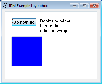
A simple use of the layoutbox can look like this:
dialog D

color ColBlue  "blue";
color ColWhite "white";

window Wi {
  .title  "IDM Example Layoutbox";
  .width  320;
  .height 240;

  layoutbox La {
    .bgc      ColWhite;
    .xauto    0;
    .xleft    10;
    .xmargin  20;
    .xright   10;
    .xspacing 10;
    .yauto    0;
    .ybottom  10;
    .ymargin  20;
    .yspacing 10;
    .ytop     10;
    .wrap     true;

    pushbutton Pb {
      .text "Do nothing";
    }

    statictext St {
      .text  "Resize window\nto see the\neffect of .wrap";
      .yauto -1;
    }

   groupbox Gb {
      .bgc    ColBlue;
      .height 100;
      .width  100;
    }
  }

  on close { exit(); }
}
The example produces this window:
 Support