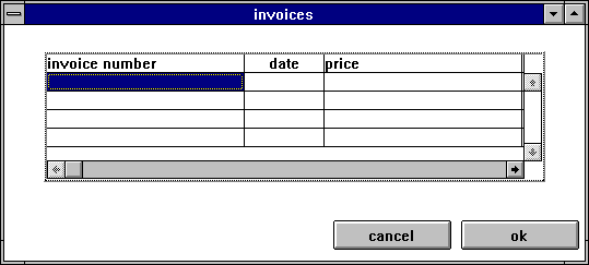
40 tablefield
By means of the tablefield object, arbitrarily formatted lists can be output and edited.
Definition
{ export | reexport } { model } tablefield { <Identifier> }
{
  <standard attributes>
  <plain attributes>
  <geometry attributes>
  <hierarchy attributes>
  <layout attributes>
  <grid attributes>
  <object-specific attributes>
}
Using the two scroll bars, the contents of the tablefield can be scrolled both horizontally and vertically. The content of the tablefield consists of static texts that can be selected.
Events
Children
Parent
Menu
Methods
Remark
To allow the dialog programmer to distinguish more precisely what the user has really done, additional querying of attributes may be necessary. The editable text belonging to the tablefield does not send any events. These are all sent to the tablefield and can be queried there.
Remarks
The select event is triggered whenever the user clicks the mouse (exception see below “Release mouse capture” or when the user presses the space bar.
The select event is available in two forms:
-
A sensitive field has been selected.
-
A select event has occurred that cannot be assigned to a single field. I.e. the user has either clicked in an insensitive field or in an area where there are no fields.
The dbselect event is triggered whenever the user double-clicks the mouse (exception see“Release mouse capture” below) or when the user presses the Ctrl and Return keys simultaneously.
The dbselect event comes in two forms:
-
A dbselect event has occurred in a field that is sensitive.
-
A dbselect event has occurred that cannot be assigned to a single field. I.e. the user has either clicked into an insensitive field or into an area where there are no fields.
However, for DM with Motif, the dbselect event is always sent with index. dbselect for insensitive fields does not exist.
The focus event is generated whenever the focus object or the focus field changes. The focus event comes in two forms:
-
A new field that can be focused has received the focus.
-
The tablefield has received the focus. There is no field that can receive the focus.
The modified event contains the index of the field that was modified.
The activate or deactivate events are generated without an index, since the activation state usually changes for more than one field.
Handling of events with index
It must always be ensured that - before accessing an index - it is checked whether an index is set at all. A check can be done with the following code fragment:
if (typeof (thisevent.index) = index) then
/*
* here you can work with the index.
* "thisevent.index.first"
* "thisevent.index.second" .
*/
else
endif
Implicit reset of tablefield states when changing tablefield attributes
For Motif, the content is not discarded for any of the attributes listed below.
The following list is for Microsoft Windows.
The list does not claim to be complete. The index attributes for the inside of the tablefield are not included in the list; however, the corresponding applies.
Deactivate the edit text without saving the content
Regardless of .edittype, the edit text is deactivated and the possibly changed content is discarded for the following attribute changes:
.colcount, .colvisible[integer], .edittext, .rowcount, .rowvisible[integer]
As of IDM version A.05.02.h, using a method that changes the content (e.g. :insert, :exchange) causes the linked edit text to be deactivated without saving its content. In previous IDM versions, the edit text remained enabled, but not all changes were displayed immediately.
Deactivating the edit text with saving the content
With the following attribute changes the edit text is deactivated and the possibly changed content is saved or discarded. If .edittype = locking, the edit text is disabled and the content is discarded.
If the .active attribute is implemented without an index, the edit text is enabled or disabled, and the content is saved only if .edittype is not locking.
When the left mouse button is pressed, a mouse capture (exclusive mouse access) is fetched. When the mouse button is released, this mouse capture is released again and a select event is generated. No select event is generated if no mouse capture is active when the left mouse button is released. The mouse capture is also released on the attribute changes listed below. Thus, it is possible that select events are prevented. This risk exists especially when processing focus events, since the focus is triggered when the mouse buttons are pressed. This complicated processing is justified to be able to assign mouse clicks correctly.
Remark
This behavior does not apply to DM with Motif.
40.1 attributes
40.2 Spec ific attributes
| attribute | Description |
|---|---|
|
Accelerator If an accelerator is assigned to a tablefield and this is pressed, the focus is set to the field in the tablefield that last had the focus. If no element had the focus yet, the focus is set to the upper left field inside the tablefield. |
|
|
Activity state of the individual cell of a tablefield. |
|
|
Active element of the object. |
|
|
Background color of a cell of the tablefield. |
|
|
Defines the type of geometry calculation when the grid is active. The detailed description can be found in the attribute description in the “Attribute Reference”. |
|
|
Text alignment in a column. See also chapter “Text alignment in tablefield”. |
|
|
Number of columns. |
|
|
First column of the tablefield displayed next to the column headers. |
|
|
Number of column headers. |
|
|
Foreground color of the column headers. |
|
|
Character set used in the column headers. |
|
|
Shadow display (similar to a button) of the column headers. |
|
|
Visibility of column headers. |
|
|
Width of the closing line of a column. See also chapter “Size calculation in tablefield”. |
|
|
Controls the interactive magnification of the column. |
|
|
Specification of the column width. |
|
|
Visibility of the column. |
|
|
Contents of a tablefield cell. |
|
|
Defines the function to be called for dynamic reloading of the tablefield. |
|
|
Controls the alignment of the tablefield. See also Chapter “Alignment of the tablefield” |
|
|
Defines how and where the tablefield is edited. |
|
|
Determines the general editability of the whole tablefield. |
|
|
Determines the editability of a cell of the tablefield. |
|
|
Defines the identifier of the editable text associated with a tablefield. This editable text must have the same father as the tablefield. |
|
|
Describes how the editable text associated with the tablefield and the contents of the tablefield work together.
|
|
|
Foreground color of the object. |
|
|
Foreground color of a cell of the tablefield. |
|
|
Sets each individual text field in the tablefield, but not column or row headers.lefields. |
|
|
Activation state of each text field in the tablefield, but without column or row headers. |
|
|
Query or set the field inside the table that has or should have the focus. |
|
|
Sets the focus to a single text field in the tablefield, but without column or row headers. |
|
|
Defines whether the cursor control should also consider non-sensitive elements in the tablefield or not. This attribute is only evaluated if .sensitive of this field is false. |
|
|
Display of the sensitive fields of the tablefield with or without shadows. |
|
|
The tablefield gets the focus. |
|
|
A certain cell of the tablefield gets or has the focus. |
|
|
Specification of the character set belonging to the object. |
|
|
Specifying the character set belonging to a cell of the object. |
|
|
Specify the format belonging to a cell of the tablefield. |
|
|
Specifies the format function associated with the object. |
|
|
Defines the function belonging to the object. |
|
|
Height of the object. See also chapter “Size calculation in tablefield”. |
|
|
Determines whether the object's horizontal scrollbar should always be displayed or only when necessary. |
|
|
Maximum number of possible characters in the input string of a tablefield cell. |
|
|
Controls the focyusability (accessibility of the object by keyboard). |
|
|
Next active cell at tablefield and.selstyle single. |
|
|
Options of the object.
|
|
|
Controls the initial selection of the text when the edit text of a tablefield is explicitly or implicitly activated.
|
|
|
Reference font for size calculation of the object. See also chapter “Size calculation in tablefield”. |
|
|
Text alignment in one row. See also chapter “Text alignment in tablefield”. |
|
|
Number of rows. |
|
|
First row of the tablefield displayed below the header rows. |
|
|
Number of tablefield headers. |
|
|
Foreground color of the headers. |
|
|
Character set used in the headers. |
|
|
Shadow display (similar to a button) of the headers. |
|
|
Visibility of the headers. |
|
|
Specification of the row height. See also chapter “Size calculation in tablefield”. |
|
|
Width of the closing line of a row. |
|
|
Controls the interactive magnification of the line. |
|
|
Visibility of the line. |
|
|
Allowed type of selection in the tablefield.
|
|
|
Control of the selection type within the tablefield.
|
|
|
Defines whether the tablefield should be selectable. This allows the object to be made insensitive in one step. |
|
|
Sensitivity control of each cell of the object. |
|
|
Activation of the size raster. See also chapter “Size calculation in tablefield”. |
|
|
Userdata for any data about any cell of the object. |
|
|
Determines whether the vertical scrollbar of the object should always be displayed or only when necessary. |
|
|
Width of the object. See also chapter “Size calculation in tablefield”. |
|
|
Describes the text alignment within a cell in horizontal direction. See also chapter “Text alignment in tablefield”. |
|
|
Horizontal raster of the object See also chapter “Size calculation in tablefield”. |
|
|
Describes the text alignment within a cell in vertical direction. See also chapter “Text alignment in tablefield”. |
|
|
Vertical raster of the object. See also chapter “Size calculation in tablefield”. |
40.2.1
Size calculation in tablefield
The .height and .width attributes can also have the value 0. This means that the Dialog Manager should calculate the corresponding size so that all elements can be displayed in the corresponding direction without the need for a scrollbar. For example, if the width of the tablefield is set to 0, it will be so wide that all columns can be completely displayed in the object.
If the tablefield has .sizeraster set, and both .xraster/.yraster and .reffont = 0, the raster definition of the direct parent object is taken. So the tablefield calculates its own size like a normal object from the raster factors of its parent. Only the size definitions inside the tablefield, collinewidth[I] and rowheight[I], refer to the raster attributes defined for the tablefield.
However, the pixel values are calculated according to the method defined for the tablefield.
40.2.2
Text alignment in tablefield
The horizontal and vertical alignment of text in a tablefield cell is set by the .colalignment[integer] and .rowalignment[integer] attributes, but the horizontal alignment is set only column-wise and the vertical alignment is set only row-wise.
Using the options[opt_new_align] option with the value true, the .xalignment[I,J] and .yalignment[I,J] attributes are taken into account instead of .colalignment[I] and .rowalignment[I]. These have the same value range/meaning as .colalignment[I] and .rowalignment[I]; however, .xalignment[I,J] and .yalignment[I,J] are double-indexed and inheritance is by direction as with all other double-indexed attributes.
The default value of .options[opt_new_align] is false.
Supported under Motif and MS Windows.
40.2.3
Attribute default values
For some attributes .attribute[0] is defined as default. This is always taken if no more value is available for the really needed value. The first correctly usable element is always .attribute[1]!
For some attributes .attribute[0,0] or .attribute[y,0] and .attribute[0,x] is defined as default. These are always taken if no more value is available for the really needed value. The first correctly usable element is always .attribute[1,1]! With the use of these Defaults two-stage one proceeds:
- If no value is defined for the required index, the index defined by the .direction attribute is set to 0. If a value is defined here, it will be taken
- However, if no value is defined here either, the global default for the attribute at .attribute[0,0] is taken.
Because of this approach, you should always define a default .attribute[0,0] for used attributes.
40.2.4
Indexing the table
All attributes provided with two indices are always indexed with [I] = Row/row and [J] = Column/column, i.e. .attribut[I, J].
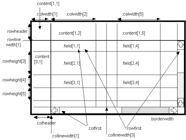
In the image above, all indices are specified as this must be defined.
40.3 Note on deprecated attributes
The deprecated .focusable attribute is no longer supported and generates an ignoring warning when setting and resetting (setinherit) the attribute, and a FAIL when reading the attribute.
40.4
Alignment of the tablefield
The .direction attribute defines the orientation of the tablefield and controls whether rows or columns take precedence. The attribute influences the adopting of row and column default values, the selection and navigation as well as certain methods.
Value range
- 1 (default)
- Vertical orientation with column priority.
- 2
- Horizontal orientation with row priority.
With . direction = 1, the column defaults, i.e. the attribute values with the indices [0,<C>], will be used for cell values (.content[index], .bgc[index], .fgc[index]…) that are not set. With .direction = 2, the row default values, i.e. the attribute values with the indices [<R>,0], will be used.
Sele
If both .selection[sel_column] and .selection[sel_row] are set to true and the cell [<R>,<C>] is selected, then with . direction = 1 the column <C> and with .direction = 2 the row <R> will be selected.
In a tablefield with multiple selection .nextactive[index] searches for the next selected cell row by row if .direction = 1 and column by column if .direction = 2. For example, if cells [4,2] and [3,5] are selected, .nextactive[1,1] will return [3,5] if .direction = 1 and [4,2] if .direction = 2.
Navigation
If .direction = 1, pressing Return will move the input focus to the next selectable cell to the right of the current cell. Home and End will jump to the beginning or end of the row with the currently focused cell.
If .direction = 2, pressing Return will move the input focus to the next selectable cell below the current cell. Home and End will jump to the beginning or end of the column with the currently focused cell.
:find() method
The .direction attribute affects the search direction of the :find() method. If .direction = 1, the tablefield is searched row by lrow, if .direction = 2, it is searched column by column. For example, if the searched value is located in cells [4,2] and [3,5], :find() without specifying a search range will return the location [3,5] if .direction = 1 and the location [4,2] if .direction = 2.
Method
The attribute .direction, together with the optional Direction parameter of the methods, controls whether the methods are applied to rows or columns. If the Direction parameter is not specified, the methods are applied to rows if .direction = 1 and to columns if .direction = 2.
40.5
Mouse interactions
If available, the following interactions are possible with the mouse:
40.5.1
Selection in the tablefield
The selection of a field is only possible if it is sensitive. This is defined via the attribute .sensitive for the entire tablefield and via the field-specific attribute .sensitive[I,J]. In addition to these attributes, the .selstyle attribute also influences the selectability of a field. Normally, the field on which the user has clicked is selected. The input focus is set to this field and marked as selected and with focus. The content of the field is immediately transferred to the associated editable text and released there for modification.
In order to distinguish the single field selection from a row/column selection, two mouse selection types must be defined. The single field selection is done as the user normally selects an object, i.e. by clicking on the object with the left mouse button. The row/column selection should be done by pressing the left mouse button and simultaneously pressing the shift key. When determining the action to be triggered, the weight of each selection type must be taken into account.
The following order applies ( > = "more important than", "takes precedence"):
This results in the following procedure for the evaluation:
-
First, it is checked whether the mouse click can be interpreted as a "single" selection or a "header" selection. If this is not possible, it is interpreted as a "row/column" selection. The direction specified in the .direction attribute is examined first.
-
First, it is checked whether the mouse click can be interpreted as a "row/column" selection. The direction specified in the .direction attribute is examined first. If this is not possible, an attempt is made to interpret it as a "single" selection or a "header" selection.
Actions on the individual tablefield selection types:
|
.selection[I] true |
Rea |
|---|---|
|
The field that currently has the focus loses the focus and passes it to the element under the mouse if these two elements are different. If the two objects are identical, nothing happens. |
|
|
The field that currently has the focus loses the focus and passes it to the element under the mouse if these two elements are different. If the two objects are identical, nothing happens. |
|
|
The column/row under the mouse is selected. The field that has been clicked on receives the focus. If the column/row is already selected, nothing happens except that the focus is set to the field under the mouse. |
|
40.5.2
Scrolling the tablefield
Scrolling in all directions is always done in sense units. Scrolling is always done in such a way that entire rows or columns are deleted from the display area and replaced by new ones. This applies to both row/column scrolling and page scrolling. It is always possible to scroll so far that the last column or row is just completely visible and there might be an empty area on the right and at the bottom. This is because the Dialog Manager guarantees that an element is visible in the upper left corner.
In detail, this looks as follows:
|
Scroll |
Rea |
|---|---|
|
Scroll Right |
The left column of the tablefield interior is scrolled out of the visible area. The second column so far is placed next to the row headers. The rest of the display area is filled with the following columns. If only one column can be displayed, the following column is brought into the display area. |
|
Scroll Left |
The previously invisible column before the first visible column is brought into the display area and the remaining visible columns are moved accordingly. If only one column can be displayed, the following column is brought into the display area. |
|
Scroll Down |
The first row of the tablefield interior is scrolled out of the visible area. The second line so far is set below the headings. The rest of the display area is filled with the following rows. If only one column can be displayed, the following column is brought into the display area. |
|
Scroll Top |
The previously invisible row of the tablefield interior is moved in front of the first row in the display area and the remaining visible rows are moved accordingly. If only one column can be displayed, the following column is brought into the display area. |
|
Page Right |
The previously last visible column becomes the first visible column and the rest of the display area is filled with the subsequent columns. If only one column can be displayed, the following column is brought into the display area. |
|
Page Left |
The previously first visible column becomes the last visible column and the rest of the display area is filled with the preceding columns. If only one column can be displayed, the previous column is brought into the display area. |
|
Page Down |
The last visible line so far becomes the first visible line and the rest of the display area is filled with the following lines. If only one line can be displayed, the following line is brought into the display area. |
|
Page Top |
The previously first visible line becomes the last visible line and the rest of the display area is filled with the preceding lines. If only one line can be displayed, the previous line is brought into the display area. |
|
Slider |
The user's scroll action is always corrected so that the first row/column in the tablefield interior is correctly visible. Of course, it can happen that the bottom row and the right column are only partially visible. |
Through this scrolling, Dialog Manager guarantees that the first row and the first column in the tablefield interior are always displayed correctly and completely, if the tablefield is only large enough. The last visible row and the last visible column can only be partially displayed if the tablefield has unfavorable dimensions. If the scrolling action is not feasible in the described form, the scrolling is performed as far as possible.
Example
The user wants to scroll page by page, but only one column is not displayed. It is then scrolled so that this column just comes completely into the display area. It can happen that an empty space remains on the right and below, because the upper left corner is always displayed correctly.
The calculation of the slider size and the maximum value of the slider is based on pixels, not on sense units of the tablefield. When calculating the slider size, the available space in the tablefield interior is set in relation to the actually required area.
This is done according to the following formula:
-
for the horizontal scrollbar
Slidersize = Scrollbarsize * (
-
for the vertical scrollbar
Slidersize = Scrollbarsize * (
When scrolling, the focus in the tablefield is not changed. This makes it possible for the focus to sit on an object in the tablefield that is not currently visible. To visualize this, the focus frame is then painted around the entire object. If the object with the focus is scrolled back into the visible area of the tablefield, the focus is only painted around the field and no longer around the entire object.
40.6
Interactions via the keyboard
The tablefield can be operated completely without a mouse. With tablefield cursor control, the tablefield must automatically perform all necessary scroll operations so that the field reached by cursor control is in the visible area of the tablefield. The cursor control is not cyclic for any direction; i.e. if there is no field allowed for cursor control in the actual search direction, the cursor stops. A field that is allowed for cursor control is either .sensitive = true or the attribute .fieldfocusable was set to true for the tablefield (i.e. non-sensitive objects can also be reached with the cursor control).
40.6.1
Keyboard mapping for navigation
The keyboard layout for navigation looks like this:
|
Taste |
Aktion |
|---|---|
|
With the help of this key, the input focus is to be set to the next field lying in the rising y-direction that is permitted for cursor navigation. This causes the input focus to move optically downwards. |
|
|
With the help of this key, the input focus is to be set to the next field lying in the falling y-direction that is permitted for cursornavigation. This causes the input focus to move optically upwards. |
|
|
With the help of this key, the input focus is to be set to the next field lying in the falling x-direction that is permitted for cursor navigation. This causes the input focus to move optically to the left. |
|
|
With the help of this key, the input focus is to be set to the next field lying in the rising x-direction that is permitted for cursor navigation. This causes the input focus to move optically to the right. |
|
|
With the help of this key the input focus is to be set to the next field lying in the direction defined by .direction. If the end of a column/row is reached, the focus remains on this element. |
|
|
These two buttons are used to exit the tablefield. This is to go to the next/previous object, according to the usual behavior of the window system. |
|
|
This button sets the focus to the first element of a row (.direction=2) or column (.direction =1) in the tablefield interior (rowindex > rowheader or colindex>colheader). It is searched starting with the element [rowheader + 1] [?] in the row to the right (.direction = 2) or starting with the element [?] [colheader + 1] in the column to the bottom (.direction = 1) until an element is found that can get the focus (.sensitive and .fieldfocusable). This element is then scrolled into the visible area of the tablefield. |
|
|
This button sets the focus on the first element (top left) in the tablefield interior (rowindex > rowheader or colindex > colheader). Starting with the element [rowheader + 1] [colheader + 1] in the row to the right (.direction = 2) or in the column downwards (.direction = 1) is searched until an element is found that can receive the focus (.sensitive and .fieldfocusable). If no element is found in the row or column, the search continues in the row below or column to the right. The found element is then scrolled into the visible area of the tablefield. |
|
|
This button sets the focus to the last element of a row (.direction =2) or column (.direction = 1) in the tablefield interior (rowindex > rowheader or colindex > colheader). It is searched starting with the element [rowcount] [?] in the row to the left (.direction = 2) or starting with the element [?] [colcount] in the column to the top (.direction = 1) until an element is found that can get the focus (.sensitive and .fieldfocusable). This element is then scrolled into the visible area of the tablefield. |
|
|
With the help of this button the focus is set to the last element (bottom right) in the tablefield interior (rowindex > rowheader or colindex > colheader). Starting with the element [rowcount] [colcount] in the row to the left (.direction = 2) or in the column to the top (.direction = 1) is searched until an element is found that can receive the focus (.sensitive and .fieldfocusable). If no element is found in the row or column, the search continues in the row above or column to the left. The found element is then scrolled into the visible area of the tablefield. |
|
|
This button can be used to bring into the display area the element in the tablefield that currently has the focus. If the object is already in the visible area, nothing happens. |
Remark
If the cursor control is used to move from the header area to the tablefield area inside, the cursor is placed on the first element visible below/next to the headers without triggering scrolling.
If the cursor control is triggered in the direction of the header (cursor Up, cursor Left) in the first element below/next to the headers, the cursor is not positioned on the header until the corresponding scrollbar is at its initial value.
(this->tablefield.?->first = this->tablefield.?->header + 1)
As long as this is not the case, scrolling is performed accordingly.
This means that the actions cursor Left followed by cursor Right and cursor Down followed by cursor Up do not have to be inverse operations.
40.6.2
Keyboard mapping for scrolling
The keyboard layout for scrolling looks like this:
|
|
A |
|---|---|
|
This button should be used to move the contents of the tablefield up by a maximum of one page. |
|
|
This button should be used to move the contents of the tablefield down by a maximum of one page. |
|
|
This button is used to move the contents of the tablefield to the left by a maximum of one page. |
|
|
This button is used to move the contents of the tablefield to the right by a maximum of one page. |
|
|
This button is used to move the contents of the tablefield up one line. |
|
|
This button is used to move the contents of the tablefield down one line. |
|
|
This button is used to move the contents of the tablefield one column to the left. |
|
|
This button is used to move the contents of the tablefield one column to the right. |
For all these scrolling actions, the scrolling behavior described in the chapter “Mouse interactions” applies.
Remark
If scrolling is triggered via the keyboard, the focus does not change its position on the screen. However, this can change its internal position or the element that currently has the focus. For example, if the cursor is in a heading and scrolling vertically, the cursor will remain in the same position both on the screen and internally. However, if the cursor is inside the tablefield, it will change its internal position in any case; the position visible on the screen, however, will remain largely unchanged.
40.6.3
Keyboard mapping for the selection
|
|
A |
|---|---|
|
Space, log. |
This button selects the field with the focus, if it is not already selected. |
|
log. |
This key triggers the row/column selection. |
The two keys "logical selection" and "logical row/column selection" depend on the window system.
40.7
Interactions with the editable text
The editable text belonging to the tablefield is automatically provided with the content of the field that currently has the focus. Additionally, the attributes .maxchars[I,J] and .format[I,J] corresponding to the current focus object are taken over.
Depending on the .edittype attribute, the actions in the editable text are transferred to the tablefield.
-
With .edittype online, all changes in the editable text are immediately applied to the tablefield.
-
With .edittype offline, the changes are not applied to the tablefield until the editable text is deselected.
-
With .edittype locking the tablefield is locked after the first input into the editable text and only after input of Return released again and the content is taken over.
If the editable text is left without a return and only by a normal deselection or the input of ESC, the changes are not accepted, but the tablefield is released again. The editable text itself does not send any events.
Remarks
-
An editable text is not activated by the cursor navigation, but only by the first character designated for the editable text.
-
When an editable text is enabled, the following navigation applies:
Cursor Left, Right
ET
ET
Cursor Up, Down
ET
ET
Return
ET
Tab (Shift + Tab)
- A multiline editable text always has scrollbars, regardless of .editpos.
- The height of an entry does not affect the number of text lines that can be entered by the user.
- Since the .format attribute is controlled by the tablefield, the attribute of the bound edit text should not be used.
40.8
Interactive column and row resizing
When the mouse is moved over the edge of a manipulable field, the mouse cursor changes and shows a resize icon. The appearance of the cursor cannot be specified by the application programmer. For columns, resizing can be done at the right border of each column. For the rows, the lower boundary is relevant.
The user can initiate the resizing with the left mouse button. A gray hatched line appears, indicating the position of the mouse (the width of the hatched line depends on the attributes .collinewidth[I] and .rowlinewidth[I]). If the mouse is moved (with the left mouse button pressed), the hatched line moves with it. The resizing is completed by releasing the mouse button.
The new attribute values of the enlarged or reduced rows/columns are automatically applied and the tablefield is redrawn accordingly (The attribute values of .rowheight[I] and .colwidth[I] are changed). This is consistent with resizing the window.
The indexed event resize[I,J] is sent to the tablefield and can be reacted to. One component of thisevent.index is zero at a time. If a row was changed, second(thisevent.index) is zero and with first(thisevent.index) the changed row can be queried. If a column was changed, then the changed column can be queried with second(thisevent.index).
The assignment at a glance:
|
Changes on |
first(thisevent.index) |
second(thisevent.index) |
|---|---|---|
|
|
Index of the changed row |
0 |
|
|
0 |
Index of the changed column |
40.9 Note for the t ablefield with Microsoft Windows
40.9.1
Application code page selection
The utfwin
code page is not suitable as an application code page when strings containing <Carriage-Return> characters must be processed. The reason is that <Linefeed> characters (line breaks) are converted to the <Carriage-Return><Linefeed> string. To avoid duplicate <Carriage-Return> characters, they are skipped. Instead of utfwin
, the code pages utf16
or utf16l
should be used, which do not perform this special handling.
40.9.2
Use of colors and Visual Styles
If no colors are set for the tablefield, the IDM uses the system colors of the respective state. If .fieldshadow = true, those Visual Styles
of the Windows object pushbutton
are used. It defines the assigned colors. If .rowheadshadow or .colheadshadow are switched on, the colors are taken from those Visual Styles
of the Windows object headeritem
.
If colors are set, they are used. For an active field, .fgc determines the background color and .bgc the foreground color. If only one of the two colors is set, the corresponding system color is used for the other color. Thus, if only one color is set, the foreground and background colors are not swapped, but the set color is assigned differently. There is no separate color assignment for an active and insensitive field. It is displayed in the same way as an active field.
Recommendation
Set either both colors – .fgc and .bgc – or neither of the two colors.
Remark
The colors were also already assigned as described in the IDM for Windows 2000. However, for active objects practically only foreground and background colors were swapped, which brought mostly a good result even with only one color set. Only the Visual Styles
(especially that of the Windows pushbutton) partly do not swap the colors anymore, but only use a different background.
40.10 Notefor the tablefield with Motif
The Motif tablefield ignores leading line breaks in the table cells (one or more \n at the beginning of the texts). To nevertheless display blank lines before a text, a space can be inserted in the text before the line breaks.
Example
" \nXYZ" \nXYZ"
40.11 Notefor the tablefield with Qt
Scrollbars are present in an extremely small tablefield where the header rows and columns cannot be displayed completely. However, these have no effect.
The tablefield has an empty row and column at the bottom and right, which fill the free area when scrolling all the way down or to the right. If the tablefield is dimensioned in such a way that the last content line or content column cannot be displayed completely, then the user can scroll to this empty line or empty column. This position cannot be queried or set programmatically.
The selection model of Qt is used, so there may be slight differences to the other window systems. However, the behavior is typical for Qt. If several of the elements sel_column, sel_row and sel_single have the value true for the attribute .selection[enum], then sel_single is used. If none of the elements sel_column, sel_row and sel_single has the value true for the .selection[enum] attribute, sel_single is used.
Activated cells are deactivated when a header cell is clicked at .selstyle[sel_header] = false.
With .fieldfocusable = true a click on an insensitive cell also causes a reactivation. The corresponding activate and deactivate events are generated, but there is no select event with index.
The following attributes are not implemented:
- .colheadshadow
- .fieldshadow
- .rowheadshadow
- .xmargin
- .ymargin
40.12 Example
The following example shows how to use the extensions:
The tablefield headings can be manipulated interactively.
window
{
  .title "Title";

  child tablefield Tf1
  {
    .xauto 0;
    .xleft 2;
    .width 30;
    .xright 2;
    .ytop 2;
    .height 30;
    .colcount 5;
    .colsizeable[1] true;
    .rowsizeable[1] true;
    .rowheight[0] 5;
    .colheader 1;
    .rowheader 1;
  }
}

!!
!! Output of changed items into Tracefile
!!
on Tf1 resize
{
  print "row: " + itoa(first(thisevent.index)) + " has been changed";
  print "column: " + itoa(second(thisevent.index)) + " has been changed";
}
 Support