5 checkbox
The checkbox is a type of button with the activation states on
and off
. A particular visual representation is linked to each of these states, so that the checkbox state is recognizable at any time. A filled square represents the on
state, an empty square represents the off
state.
Definition
{ export | reexport } { model } checkbox { <Identifier> }
{
  <standard attributes>
  <plain attributes>
  <hierarchy attributes>
  <layout attributes>
  <text attributes>
  <object-specific attributes>
}
Important note on tab navigation
Checkboxes are assigned to Tab groups by the window systems. The group is mostly determined by the parent object. Single checkboxes can be reached individually with the Tab key. For checkboxes within a group, only one group element can be reached via the Tab key. The cursor keys are used to navigate within the group.
The .navigation attribute can be used to influence the Tab navigation. It determines whether a checkbox in the Tab navigation belongs to a group of elements or is treated as a stand-alone element.
Events
Children
Parent
Menu
5.1 attributes
5.2 Spec ific attributes
| attribute | Description |
|---|---|
|
Defines at .style = checkbox (2) whether the object should have the state See chapter “Checkbox as a tristate button” |
|
|
Height of the object. At value 0 the IDM calculates the height automatically based on the current character set. |
|
|
Determines whether a checkbox belongs to a group of elements or is treated as a stand-alone element in the Tab navigation. Stand-alone checkboxes can be reached individually with the Tab key. For checkboxes within a group, only one group element can be reached by Tab key. The cursor keys are used to navigate within the group.
|
|
|
Options of the object. Indi |
|
|
Current activation state of the object. Possible values:
See chapter “Checkbox as a tristate button” |
|
|
Sets the appearance and behavior of the object. Possible values:
See chapter “Checkbox as a tristate button” |
|
|
Displayed text (caption). |
|
|
Width of the object. At value 0 the IDM calculates the width automatically based on the current character set. |
5.3 Checkbox as a t ristate button
Checkbox and Tristatebutton are implemented in ISA Dialog Manager using the same object. The .style attribute controls what type of object is displayed. The representation of the tristate button depends on the corresponding window system.
The states of the checkbox (as a tristate button) can be queried and set via the .state attribute.
For a tristate button, the .active attribute always returns false. Therefore, it is not suitable for querying the state of the checkbox. This does not change even if the checkbox is dynamically changed from .style = tristate (3) to .style = checkbox (2) at runtime.
The activate and deactivate events are not available for a tristate button.
Whether the interactive selection of the tristate button switches between all three states or only between on
(state_checked) and off
(state_unchecked), as well as the sequence when switching between the three states, is defined by the respective window system. The IDM has no influence on this.
5.4 Note
for c heckbox for Microsoft Windows
Concerning the background color, please refer to the notes on attribute .bgc in the “Attribute Reference”.
5.5 Example
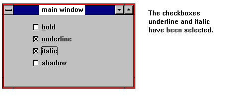
Four navigable checkboxes within one window. The first two within a group:
window MAIN
{
  /* tab navigation via grouping.
   * within the group each checkbox
   * can be reached using cursor keys */
  groupbox
  {
    .xleft 10;
    child checkbox Bold
    {
      .ytop 10;
      .text "bold";
      .visible true;
      .active false;
    }

    child checkbox Underline
    {
      .ytop 40;
      .text "underline";
      .visible true;
      .active true;
    }
  }

  /* tab navigation via .navigation.
   * each checkbox can be reached
   * individually using Tab key */
  child checkbox Italic
  {
    .xleft 10;
    .ytop 70;
    .text "italic";
    .visible true;
    .active true;
    .navigation navi_tab;
  }

  child checkbox Shadow
  {
    .xleft 10;
    .ytop 100;
    .text "shadow";
    .visible true;
    .active false;
    .navigation navi_tab;
  }
}
 Support