2.348 .style
The attribute .style determines the appearance and behavior of the object.
Definition
-
Data type
integer (menusep)
integer, class (checkbox, image, menuitem)
integer, string (listview)
class (datetime, poptext, toolbar)
enum (filereq, font)
datatype (spinbox)
-
Access
get, set
-
changed event
yes
no (font)
-
C
Data type: DT_integer (menusep)
Data type: DT_integer, DT_class (image, menuitem)
Data type: DT_integer, DT_class/DT_enum (checkbox)
Data type: DT_integer, DT_string (listview)
Data type: DT_class (datetime, poptext, toolbar)
Data type: DT_enum (filereq, font)
Data type: DT_datatype (spinbox)
-
COBOL
Data type: DT-integer (menusep)
Data type: DT-integer, DT-class (image, menuitem)
Data type: DT-integer, DT-class/DT-enum (checkbox)
Data type: DT-integer, DT-string (listview)
Data type: DT-class (datetime, poptext, toolbar)
Data type: DT-enum (filereq, font)
Data type: DT-datatype (spinbox)
-
Classification
object-specific attribute
-
Objects
checkbox, datetime, filereq, font, image, listview, menuitem, menusep, poptext, spinbox, toolbar
2.348.1 checkbox, image, listview, menuitem and menusep
The .style attribute determines whether the checkbox can take on two or three states.
set
), values of the data types integer and class/enum can be specified.get
) always returns a value of the data type integer.
Value range
- 2 | checkbox
-
The checkbox can assume the two states
on
andoff
.Its state can be queried and set with the .active attribute.
Interactive state changes by the user trigger activate or deactivate events.
- 3 | tristate
-
The checkbox can assume the three states
on
,off
andindefinite
.Its state can be queried and set with the .state attribute.
Interactive state changes by the user do not trigger activate or deactivate events.
When setting the value 3, the checkbox is displayed in the indefinite
state.
With the attribute .style, the image object can be enabled to display two states or – on Microsoft Windows – to open a context menu at a mouse click. Thus the object can be used as customized checkbox or as illustrated menu element.
set
), values of the data types integer and class can be specified.get
) always returns a value of the data type integer.
Value range
- 0 | pushbutton
- The image object is selectable like a pushbutton.
- 2 | checkbox
-
The image object can be toggled between the states
active
andinactive
.Each state can be assigned its own image (tile resource) with the .picture[enum] attribute.
- 3 | menubox
-
The image object has the behavior of a menubox. A mouse click opens the context menu. In this style no select event is triggered.
When the context menu is open, the images .picture[tile_active] or .picture[tile_active_mouse_over] are displayed.
If a context menu is not available, no menu action is triggered. The state of the image object is nevertheless adjusted accordingly and the image belonging to the state is displayed from the .picture[enum] attribute.
The exact processing of the action depends on the respective window system. Also the focus is handled as it is usual for menus on the respective window system.
Availability
Microsoft Windows
This attribute determines the presentation mode of the listview.
set
), values of the data type integer, string and text resources can be specified.
get
) always returns a value of the data type integer.
Value range
- 0 | "icon" | "picture"
-
Icon view with large icons.
Arrangement of list items first from left to right, then from top to bottom.
The icon is placed above the item's caption.
- 1 | "smallicon" | "smallpicture"
-
Icon view with small icons.
Arrangement of list items first from left to right, then from top to bottom.
The icon is placed to the left of the item's caption.
- 2 | "list"
-
List view with small icons.
Arrangement of list items first from top to bottom, then from left to right.
The icon is placed to the left of the item's caption.
- 3 | "detail" | "report"
-
List with small icons where the list items are arranged one below the other.
A small icon is shown to the left of the caption.
For each list item, detailed information is displayed in several columns.
The presentation resembles a table.
- 4 | "tile"
-
Display of the list items as tiles with large icons on the left and captions on the right.
Arrangement of the list items one below the other.
For invalid values, the default value 0 is used. However, the attribute value is not changed.
The attribute defines the kind of menu item.
set
), values of the data types integer and class can be specified.get
) always returns a value of the data type integer.
For menuitems that are direct children of a window, the .style attribute is ignored.
Value range
- 0 | pushbutton
- Usual menu item, commonly used to trigger an action.
- 1 | radiobutton
-
Menu item with with two states and the behavior of a radiobutton.
In general, multiple menu items of this kind are used to select one from several mutually exclusive options via the menu.
A group of menuitems with .style = radiobutton, in which only one of the menu options can be activated, is delimited by the menu beginning, the menu ending or menu separators.
- 2 | checkbox
- Menu entry with two states and the behavior of a checkbox, which is usually used to make a setting via the menu.
The attribute defines the appearance of the menu separator.
Value range
- 0
- Default separation line of the respective window system.
- 1
- Single line.
- 2
- Double line.
Note for the IDM for Windows
The .style attribute of the menu separator is ignored by the IDM for Windows.
2.348.2 datetime, poptext and toolbar
The attribute determines the appearance and the method of operation at the datetime object.
Value range
- poptext
- To select a date, a calendar can be opened.
- spinbox
- Values can be set using a spinbox.
Note
Changing the attribute in the visible state leads to a reset of the object and should be avoided.
At the poptext, the .style attribute determines how the list is displayed and whether the content of the input field can be edited by the user.
Value range
- edittext
-
The list is closed and can be expanded and collapsed by the user. The content of the input field can be edited.
The user can select an existing item from the list or enter a different value.
- listbox
-
The list is always open and the content of the input field can be edited.
The user can select an existing item from the list or enter a different value.
- poptext
-
The list is closed and can be expanded and collapsed by the user. The content of the input field can not be edited.
The user can only select an item that already exists in the list.
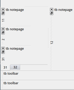
The toolbar can have two different forms on Qt, which are set via the .style attribute. By default, the style toolbar is active, which visually matches the familiar toolbars.
Value range
- notepage
- Toolbars use a dock area that lies between toolbars and inner area.
Tabbed toolbars
andnested toolbars
are possible. - toolbar
- Conventional toolbar, corresponding to the well-known IDM toolbar.
The style notepage allows to nest multiple toolbars in in one docking area and arrange them as tabs
toolbars of different styles defined in the same docking area cannot be mixed and are grouped according to their style. Toolbars with the style toolbar are always positioned at the outer edge of the window and toolbars with the style notepage are always positioned between the client area of the window and the toolbars with the style toolbar
Availability
The attribute .style at the toolbar is only supported by the IDM for Qt.
See also
Attribut
2.348.3 filereq (File Requester )
The attribute determines the displayed system dialog and thus the purpose (mode) of the file requester.
Value range
- fr_directory
-
System dialog for selecting a directory.
- fr_load
-
System dialog for opening files.
- fr_save
-
System dialog for saving files.
Particularities of the IDM for Windows
Different system dialogs are used for the different modes. Their characteristics such as labels (e.g. of the buttons), color and font are mainly predefined for the respective purpose and cannot be redefined.
The fr_directory mode is more restrictive in the handling of the .directory and .pattern attributes. Additionally, it does not permit the input of a non-existent directory.
2.348.4 font
For the font resource, the .style attribute determines which font style of the selected character set is used. To ensure better independence and combinations between face/slant and weight, the .style attribute has been changed to both .face and .weight attributes. However, the .style attribute can still be used.
Value range
- face_default
-
Regular, unchanged character representation.
- face_light
-
Light character representation.
- face_normal
-
Regular, unchanged character representation.
- face_medium
-
Font weight between face_normal and face_demibold.
- face_demibold
-
Font weight between medium and bold.
- face_bold
-
Bold character representation.
- face_black
-
Black character representation.
- face_italic
-
Italic character representation.
In contrast to face_oblique, usually special, italic characters are used.
- face_oblique
-
Inclined, slanted character representation.
In contrast to face_italic the oblique character representations are usually derived from the regular characters.
face_oblique is equivalent to face_italic on Microsoft Windows.
- face_roman
-
Upright, straight character representation (ignored on Microsoft Windows).
2.348.5 spinbox
At the spinbox, the attribute .style defines the type of the displayed values.
Value range
- integer
-
The numerical values from the interval .minvalue … .maxvalue are displayed.
The current value can be queried and set with the .curvalue attribute.
- string
-
The texts from the .text[integer] attribute are displayed.
The index of the current value can be queried and set with the .activeitem attribute.
- void
-
The display in the child object is controlled by the application.
The values are switched as with .style = integer, except that the value displayed in the child object (edittext or statictext) is not changed automatically but must be set by the application.