27 poptext (Combobox)
With this object textual information can be displayed in a space-saving way, if only one piece of information out of several pieces of information is needed.
Definition
{ export | reexport } { model } poptext { <Identifier> }
{
  <standard attributes>
  <plain attributes>
  <geometry attributes>
  <hierarchy attributes>
  <layout attributes>
  <text attributes>
  <object-specific attributes>
}
In the description combobox
is used as a synonym for poptext.
Events
Children
Parent
Menu
27.1 Attributes
|
Attribute |
RSD |
PSD |
Properties |
Short Description |
|---|---|---|---|---|
|
string object |
string text |
S.G/D/C |
overwrites the Automation Identifier for Microsoft UI Automation |
|
|
object string |
text string |
S.G/D/C |
overwrites the Automation Name for Microsoft UI Automation |
|
|
identifier |
accel |
S,G/D/C |
accelerator of object |
|
|
integer |
integer |
S,G/D/C |
active text item of combobox |
|
|
integer (-1, 0, 1) |
integer |
S,G/D/C |
text alignment |
|
|
identifier |
color |
S,G/D/C |
background color of object |
|
|
boolean |
boolean |
S,G/D/- |
controls computation of geometry with active grid |
|
|
class |
class |
-,G/-/- |
object class |
|
|
string |
string |
S,G/-/- |
displayed text of object |
|
|
identifier |
instance |
-,G/-/- |
control which the object belongs to |
|
|
identifier |
cursor |
S,G/D/C |
cursor belonging to the object |
|
|
boolean |
boolean |
S,G/-/- |
cut operation has not been executed yet |
|
|
boolean |
boolean |
-,G/-/- |
state of change during cut operation |
|
|
identifier |
instance |
-,G/-/- |
dialog for object |
|
| object | document | S,G/-/- |
accesses the I-th XML Document |
|
|
boolean |
boolean |
S,G/D/C |
editability of editable text |
|
|
integer |
integer |
S,G/D/C |
end of the selection in the input field |
|
|
boolean |
boolean |
-,G/-/- |
returns if the object class is an USW class |
|
|
class |
class |
-,G/-/- |
returns the I-th registered USW class |
|
|
identifier |
color |
S,G/D/C |
foreground color of object |
|
|
object |
record |
S,G/-/C |
accesses the first record of an object |
|
|
boolean |
boolean |
-,G/-/- |
keyboard focus of object |
|
|
identifier |
font |
S,G/D/C |
font of object |
|
|
identifier |
func |
S,G/D/C |
function of object |
|
|
string identifier |
string format |
S,G/D/C |
formatstring of a text |
|
|
identifier |
func |
S,G/D/C |
link of application function to editable text |
|
|
identifier |
instance |
-,G/-/- |
groupbox which the object currently belongs to |
|
|
integer |
integer |
S,G/D/C |
indicates height of object |
|
|
string identifier |
string text |
S,G/D/C |
helptext of object |
|
| .hinttext | string | string | S,G/D/C | placeholder text of object (see also chapter “Notes for attribute .hinttext”) |
|
integer |
integer |
-,G/-/- |
current index of object in the child list of its parent |
|
|
integer |
integer |
S,G/D/C |
number of elements in combobox |
|
|
string |
string |
S,G/D/C |
name (identifier) of object |
|
|
object |
record |
S,G/-/C |
accesses the last record of an object |
|
| object | object | -,G/-/- | layoutbox of object | |
|
boolean |
boolean |
S,G/D/- |
defers the display of a visibly created object |
|
|
integer |
integer |
S,G/D/C |
maximum number of characters to be input in edittext |
|
|
attribute |
attribute |
-,G/-/- |
i-th user-defined attribute of object |
|
|
integer |
integer |
-,G/-/- |
number of user-defined attributes |
|
|
identifier |
instance |
S,G/D/C |
menu of object |
|
|
identifier |
instance |
S,G/D/C |
model belonging to model |
|
|
identifier |
instance |
-,G/-/- |
notepage which object currently belongs to |
|
|
boolean |
boolean |
S,G/D/- |
special options of object |
|
|
identifier |
instance |
S,G/-/- |
parent of object |
|
|
integer |
integer |
S,G/D/- |
height of the space for pictures displayed left of the items |
|
|
object |
tile |
S,G/D/C |
picture for each item |
|
|
object |
tile |
S,G,D,C |
picture for each item when the item is selected |
|
|
integer |
integer |
S,G/D/- |
width of the space for pictures displayed left of the items |
|
|
boolean |
boolean |
S,G/D/C |
indication of positions refers to raster |
|
|
integer |
integer |
-,G/-/- |
actual height of object |
|
|
boolean |
boolean |
-,G/-/- |
actual change of content |
|
|
boolean |
boolean |
-,G/-/- |
actual selectability of object |
|
|
boolean |
boolean |
-,G/-/- |
actual visibility of object |
|
|
integer |
integer |
-,G/-/- |
actual width of object |
|
|
integer |
integer |
-,G/-/- |
real distance to left (in pixel) |
|
|
integer |
integer |
-,G/-/- |
real distance to top (in pixel) |
|
|
object |
record |
S,G/-/C |
accesses the I-th record of an object |
|
|
integer |
integer |
-,G/-/- |
queries the number of child records |
|
|
integer |
scope |
-,G/-/- |
queries the object type (Default, Model or instance) |
|
|
boolean |
boolean |
S,G/D/C |
selectability of object |
|
|
integer |
integer |
S,G/D/C |
number of visible items |
|
|
boolean |
boolean |
S,G/D/C |
size referring to raster of parent object |
|
|
integer |
integer |
S,G/D/C |
start of the selection in the input field |
|
|
string identifier |
string text |
S,G/D/C |
text to be displayed in statusbar |
|
|
class |
class |
S,G/D/C |
type of poptext, normal, editable (combobox) or listbox-like |
|
|
string identifier |
string text |
S,G/D/C |
sets individual texts |
|
| object | object | -,G/-/- | toolbar of object | |
|
anyvalue |
anyvalue |
S,G/D/C |
userdata of object of any datatype |
|
|
anyvalue |
anyvalue |
S,G/D/C |
userdata of combobox items of any datatype |
|
|
boolean |
boolean |
S,G/D/C |
visibility of object |
|
|
integer may be 0 |
integer |
S,G/D/C |
current width of object |
|
|
identifier |
instance |
-,G/-/- |
window which object currently belongs to |
|
|
integer (-1, 0, 1) |
integer |
S,G/D/C |
type of x-coordinatedefinition |
|
|
integer |
integer |
S,G/D/C |
x-coordinate, distance to the left |
|
|
integer |
integer |
S,G/D/C |
x-coordinate, distance to the right |
|
|
integer (-1, 0, 1) |
integer |
S,G/D/C |
type of y-coordinate definition |
|
|
integer |
integer |
S,G/D/C |
y-coordinate, distance to bottom |
|
|
integer |
integer |
S,G/D/C |
y-coordinate, distance to top |
27.2 Specific Attributes
Standard Attributes
In the combobox there is a .userdata attribute for each item which can be accessed by index. Without an index the usual .userdata attribute will be accessed.
Plain Attributes
These attributes are used to define size and position of the combobox. If the attributes .width or .height are set to 0, the DM will calculate the corresponding size automatically.
Attribute to control the creation of the activate and select events
The attribute .options[opt_old_select] controls the creation of the activate and select events, it is normally set to false.
If the attribute .options[opt_old_select] is set to false, then the select/activate events will be generated analog to the other sample objects, such as the listbox and treeview.
First modification to the old
behavior is that the activate events no longer indicate the receiving of the focus (edittext and listbox style), but rather show a change in the activation status (.activeitem attribute). Secondly, a select event is only created by a "completed" selection of the user. This is true even when the same entry is selected a second time. In this sense "completed" means that the list is closed (exception: comment (1) and (2)) or when the modification does not require that the list be made visible.
|
Data type |
boolean |
|
Value range |
false, true |
|
Default value |
false |
|
Access |
get, set |
|
Supported on |
Microsoft Windows, Unix |
Summary
For a poptext with the attribute .options[opt_old_select]=false, the select and activate where triggered under the following conditions:
|
Action |
Motif 1.2 |
Motif 2.1 |
MS Win |
Event |
|---|---|---|---|---|
|
cursor selection (close list, on different entry) |
* |
* |
* |
- activate and select |
|
cursor selection (open list, on different entry) |
* |
* |
* |
- activate (and select in listbox style) |
|
mouse selection (list open, same entry) |
* |
* |
* |
select |
|
mouse selection (list open, different entry) |
* |
* |
* |
activate and select |
|
close list (i.e. Return but no mouse selection) |
* |
* |
* |
select |
|
abort list (2) (i.e. Esc) |
* |
* |
* |
activate in order to return to original entry |
Comments
- The poptext list in the style listbox is always open. Therefore the keyboard selection behaves analog to the mouse selection. Naturally, in this style the list cannot be "aborted".
- Only on some window systems is it possible to abort an open list.
- The keys which can be used for cursor selection is dependent upon the system in use; normally these are the Up and Down cursor keys.
Example for the use of separate events with .options[opt_old_select] = false
-
In order to be aware of all changes that have taken place (even in open lists)
poptext Pt {
.options[opt_old_select] false;
on activate {...}
} -
In order only to react to the selection of another list item
poptext Pt {
.options[opt_old_select] false;
on select {
if (thisevent.value <> thisevent.index) then
...
endif
}
} -
In order to react to every selection
poptext Pt {
.options[opt_old_select] false;
on select {...}
} -
"on activate" is no longer to be used when the receipt of the focus is meant. Now this should be written as follows
poptext Pt {
.options[opt_old_select] false;
on focus {...}
}
Text Attributes
Text attributes are active in the styles "edittext" and "listbox" only. Usually (.style poptext) these attributes are ignored. .content is only readable in Style poptext. .content is a dynamic attribute in a combobox. It may be set during runtime only. This attribute cannot be defined statically in the dialog file.
The combobox contains three different types of representation and editability. These types are controlled with the attribute .style:
-
poptext
The combobox is not editable and is only used to represent a usually fixed number of items.
-
edittext
The combobox is editable and may be changed by the user. Basically this type is used to administrate dynamic lists. You may add further items to the list and select items.
-
listbox
The combobox is editable and is always open, allowing you to quickly select an item from a given list (similar to listbox) or to specify an item yourself. This is helpful for search processes.
The event processing in the combobox (.style edittext or listbox) is different from the actual edittext. The select event for the combobox behaves different from the one for the edittext.
With the styles .style = edittext and .style = listbox, the attribute .real_modified indicates, whether the content actually has changed since the combobox has received the focus.
This attribute is supported only by Windows and Qt. The poptext object must have the edittext style set.
On Windows, .hinttext is also supported if the attribute .style has the value listbox.
Note for Dialog Manager on Microsoft Windows
The height of a combobox cannot be set. The corresponding window system will automatically choose a value depending on the font.
The poptext supports Dialog Manager opt_hscroll option as of IDM version A.06.01.h. The horizontal scrollbar appears within the display area and thus covers the lowest lines. A vertical scrollbar is then also displayed for this purpose. Since the operation of scrollbars in an open list is not easy for the user, this option should only be used if there is no other solution.
Note for Dialog Manager on Motif
The attribute .showitem is not available since Motif version 2.1
27.3 Differences and special features Qt
On Qt, a maximum of 10 entries are displayed in an open poptext by default. If the poptext list contains more than 10 entries, then a scrollbar is additionally displayed in the list.
The .showitem attribute is ignored in the mac
and gtk+
UI styles. In UI style cleanlooks
, .showitem is ignored with .style = poptext, here always the complete list is displayed.
With .style = listbox, .showitem is completely ignored.
With the styles poptext and edittext, navigating through the open list using the arrow keys does not automatically select the accessed entry. A final selection must be completed with Enter. This is Qt default behavior.
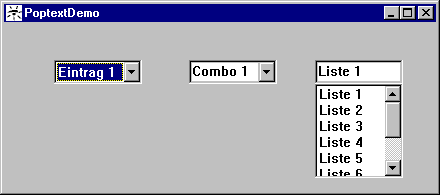
27.4 Example
window PoptextDemo
{
.active false;
.title "PoptextDemo";
child poptext Poptext
{
.xleft 5;
.ytop 1;
.text[1] "Item 1";
.text[2] "Item 2";
.text[3] "Item 3";
.text[4] "Item 4";
.activeitem 1;
.showitem 4;
}
child poptext Combox
{
.xleft 20;
.ytop 1;
.text[1] "Combo 1";
.text[2] "Combo 2";
.text[3] "Combo 3";
.text[4] "Combo 4";
.activeitem 1;
.style edittext;
.showitem 4;
}
child poptext Listbox
{
.xleft 34;
.ytop 1;
.height 5;
.text[1] "List 1";
.text[2] "List 2";
.text[3] "List 3";
.text[4] "List 4";
.text[5] "List 5";
.text[6] "List 6";
.text[7] "List 7";
.text[8] "List 8";
.activeitem 1;
.style listbox;
}
}
 Support