14 image
This object is used to present images or charts. These images may be defined directly in the DM file or they may be imported from an external file.
Definition
{ export | reexport } { model } image { <Identifier> }
{
  <standard attributes>
  <plain attributes>
  <geometry attributes>
  <hierarchy attributes>
  <layout attributes>
  <text attributes>
  <object-specific attributes>
}
Events
Children
Parent
Menu
14.1 attributes
14.2 Spec ific attributes
| attribute | Description |
|---|---|
|
Indicates the active/inactive states. See also |
|
|
Horizontal presentation of the text. Default: 0. (See also .spacing |
|
|
defines the style, i.e. representation and characteristics of the borders (since IDM version A.06.01.a) Attribute is supported, but only border_none and border_toolkit are permitted. border_plain, border_raised and border_sunken are mapped to border_toolkit. |
|
|
Determines whether the object gets the focus by mouse click. |
|
|
Height of the object. At value 0 the DM automatically calculates the correct object size for the object. |
|
|
Background color of the image. The .imagebgc file is treated the same on all window systems (Windows, Motif, Qt) and controls the background color of the image in the transparent areas. This applies to internal patterns as well as to other image types that support transparency. In contrast, setting a .bgc background color on the image object affects the entire object. |
|
|
Foreground color of the image. Evaluated only if the displayed image is not loaded from an external file. |
|
|
Index of the object in the child vector of the parent object. |
|
|
Determines whether the object responds to mouseover events. See also |
|
|
Options of the object. Index: opt_center_toolhelp ( |
|
|
Specifies the tile pattern or image of the object. See also |
|
|
Specifies the tile pattern or image of the object for the different states. See also |
|
|
Space between image and text. (See also alignment |
|
|
Defines whether the object can represent the active/inactive states by different images or not. See also In addition, under Windows you can specify whether the image should behave as a menu (see also chapter “Usage as menuitem replacement”). |
|
|
Specifies the text associated with the object. It will be displayed below the image. |
|
|
Position of the image in the object.
|
|
|
Width of the object. At value 0 the DM automatically calculates the correct object size for the object. |
|
|
Vertical distance between content and margin. See also |
|
|
Horizontal distance between content and border. See also |
14.2.1
Combination of the layout attributes
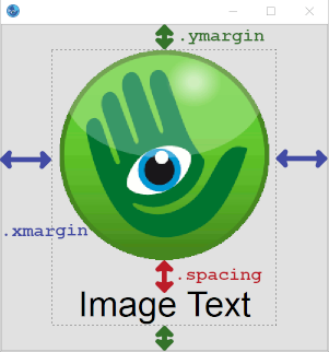
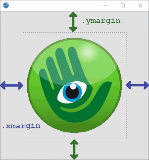
The attributes .xmargin and .ymargin define the distances between image border and display area (border shown dashed in the following image). The attribute .spacing defines the distance between tile and text within the display area of the image.
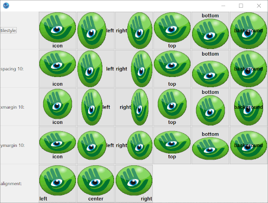
The following is an example of the effect of some attributes (the tile has the .scalestyle propscale):
See also
14.2.2
Image display and mouseover events
The image to be displayed (e.g. a tile resource) is usually defined in the .picture attribute.
If the picture object is to display different pictures in different states (active, inactive...) (see attributes .style and .active) or react to mouseover, the necessary settings must be made in the attributes .picture[enum] or .mouseover (see “Attribute Reference”).
14.2.3
Usage as menuitem replacement
The image object can be used with a menu box style under Microsoft Windows. To do this, the attribute .style must be given the value menubox. Menus similar to Microsoft Office can then be designed. It makes sense to define all image objects with .style = menubox as children of a toolbar object. Furthermore, such a window should not have any other menus.
Beispiel
color MENU_BGC rgb(191,219,255);
tile TI_DEFAULT "xdefault.bmp" scale;
tile TI_OVER "xover.bmp" scale;
tile TI_ACTIVE "xactive.bmp" scale;
font MENU_FONT "ANSI_VAR_FONT";
model image Menu
{
.style menubox;
.borderwidth 0;
.mouseover true;
.focus_on_click false;
.font MENU_FONT;
.picture[tile_default] TI_DEFAULT;
.picture[tile_mouse_over] TI_OVER;
.picture[tile_active] TI_ACTIVE;
.picture[tile_active_mouse_over] TI_ACTIVE;
.tilestyle tilestyle_background;
}
model toolbar Menubar
{
.docking dock_up;
.autosize true;
.sizeable[docking] false;
.tile TI_DEFAULT;
.tilestyle tilestyle_stretched;
.bgc MENU_BGC;
}
14.3 Differences and special features Qt
The color .bgc is used if .imagebgc is not specified for internally defined tiles and to color transparent areas of external tiles.
With .borderwidth = 0, the image gets the style flat
, meaning that no frame is drawn. However, pressing the mouse button draws a frame to represent the pressed state.
14.4 Example
dialog Test
{
}
tile TestTile "IMAGE:Setup.bmp";
window WnTest
{
.width 277;
.height 257;
.title "Testfenster";
child image Im1
{
.xleft 34;
.ytop 47;
.picture TestTile;
}
}
 Support